The appearance of ComboBox elements is easily customizable. You can customize the style and appearance of the ComboBox elements using the C1Style class. This class simplifies the manipulation of CSS properties and provides various properties to style the elements.
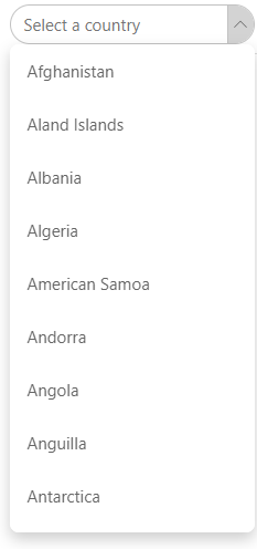
The following example uses the example created in the Quick Start section and illustrates use of the C1Style class for customizing the appearance of the border and drop-down button of the ComboBox control. This example shows the usage of ButtonStyle property of the C1ComboBox class to change the style of the button used to toggle the drop-down and the CollapsedButtonIcon property to change the icon of the collapsed drop-down. In addition, it demonstrates Style property of the C1ComboBox class, which applies style to the C1ComboBox component itself.
| Razor |
Copy Code
|
|---|---|
@using C1.Blazor.Core @using C1.Blazor.Input <C1ComboBox ItemsSource="countries" T="Country" Text="Select a Country" Style="@("margin:8px 0;border-radius:18px;padding:7px 12px")" ButtonStyle="@("background-color:lightgray;border-left: 1px solid #c2c2c2;")" CollapsedButtonIcon="C1IconTemplate.ChevronDown" /> @code { IEnumerable<Country> countries; protected override void OnInitialized() { countries = Country.GetCountries(); } } |
|