Accordion provides various options to style its appearance, so that you can generate Accordion as per your requirement and change the look and feel of your application. It allows you to use different styling properties available in the C1Accordion class which allows you to easily style various visual aspects of the control. The following table lists all the styling properties available in the C1Accordion class:
| Accordion Properties | Description |
|---|---|
| Style | Changes the style of Accordion |
| ItemStyle | Changes the style of the accordion items |
| HeaderStyle | Changes the style of the accordion header |
Additionally, you can style the accordion items individually in Accordion using the following properties available in the AccordionItem class.
| Accordion Item Properties | Description |
|---|---|
| ItemStyle | Changes the style of the accordion items |
| ItemHeaderStyle | Changes the style of the accordion item header |
The following GIF showcases styling applied on the Accordion and the accordion items.
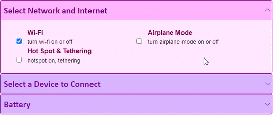
The following code demonstrates how you can style the Accordion control using different styling properties of Accordion and AccordionItem.
| Razor |
Copy Code
|
|---|---|
<C1Accordion ItemStyle="@("border-radius:4px;overflow:hidden;border:solid 1px rgba(141,6,141,1);background-color:#f9e6ff;font-weight:bold")" HeaderStyle="@("color:#8600b3;background-color:#d9b3ff;font-family:calibri;font-size:22px")" Style="@("overflow:hidden")"> <AccordionItem Header="Select Network and Internet" ItemHeaderStyle="@("color:#800080;background-color:#ffb3ff;font-family:calibri;font-size:22px")" ItemStyle="@("border-radius:4px;overflow:hidden;border:solid 1px rgba(141,6,141,1);background-color:#ffe6ff;font-weight:bold")"> <div class="accordion-item-content"> <div class="item-input"> <input id="wifi" type="checkbox" checked /> <label for="wifi"> Wi-Fi <span>turn wi-fi on or off</span> </label> </div> <div class="item-input"> <input id="apmode" type="checkbox" /> <label for="apmode"> Airplane Mode <span>turn airplane mode on or off</span> </label> </div> <div class="item-input"> <input id="hotspot" type="checkbox" /> <label for="hotspot"> Hot Spot & Tethering <span>hotspot on, tethering</span> </label> </div> </div> </AccordionItem> <AccordionItem Header="Select a Device to Connect"> <div class="accordion-item-content"> <div class="item-input"> <input id="dev1" type="checkbox" /> <label for="dev1"> Gear Fit2 Pro <span>health monitor</span> </label> </div> <div class="item-input"> <input id="dev2" type="checkbox" /> <label for="dev2"> SYNC <span>car connection</span> </label> </div> <div class="item-input"> <input id="dev3" type="checkbox" /> <label for="dev3"> Samsung XT-9343 <span>TV</span> </label> </div> </div> </AccordionItem> <AccordionItem Header="Battery"> <div class="accordion-item-content"> <div class="item-input"> <input id="bat-sav" type="checkbox" /> <label for="bat-sav"> Battery Saver <span>slow down to reduce battery usage</span> </label> </div> <div class="item-input"> <input id="bat-adapt" type="checkbox" /> <label for="bat-adapt"> Adaptive Battery <span>detect when apps drain battery</span> </label> </div> <div class="item-input"> <input id="bat-pct" type="checkbox" /> <label for="bat-pct"> Battery Percentage <span>show battery percentage</span> </label> </div> </div> </AccordionItem> </C1Accordion> <style> .accordion-item-content { margin: 20px; grid:auto-flow; } .item-input{ width:40%; box-sizing:border-box; position:relative; display:inline-block; max-width:100%; margin: 0 20px; } .item-input input[type=checkbox]+label{ padding-left:10px; color:#8C0052; } .item-input > label > span{ display:block; font-weight: normal; font-size:90%; opacity:.90; color:black; } .app-item input[type=checkbox]{ margin-left: 20px; } </style> |
|