You can change the type of the FlexChart control depending on your requirement. Chart type can be changed by setting the ChartType property of the FlexChart control. In this case, if multiple series are added to the FlexChart, all of them are in of the same chart type. To know how to add multiple series and to set a different ChartType of each series, see Mixed Charts.
FlexChart supports the following chart types.
| Razor |
Copy Code
|
|---|---|
.ChartType(C1.Web.Mvc.Chart.ChartType.Bar) |
|
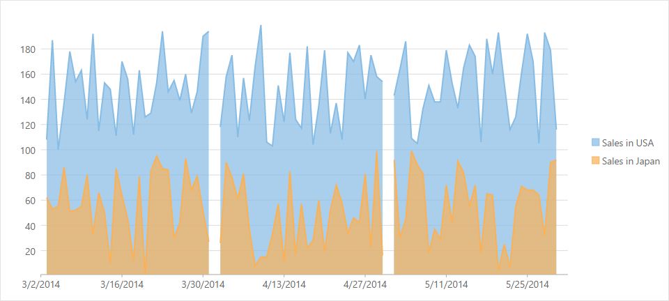
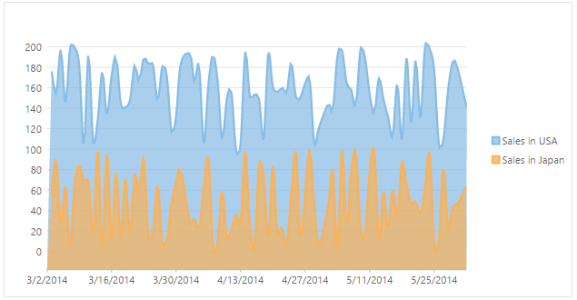
An Area chart draws each series as connected points of data and the area below the connected points is filled with color to denote volume. Each new series is drawn on top of the preceding series. The series can either be drawn independently or stacked.
These charts are commonly used to show trends between associated attributes over time.
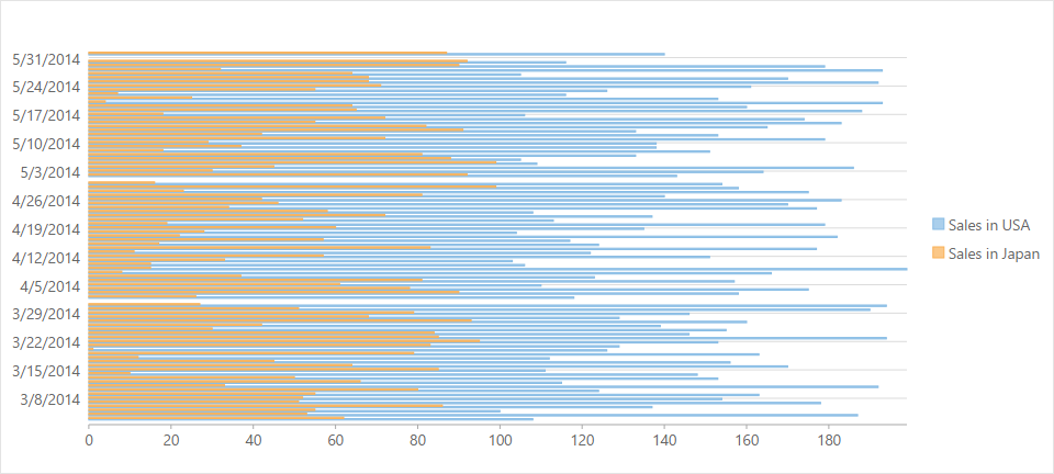
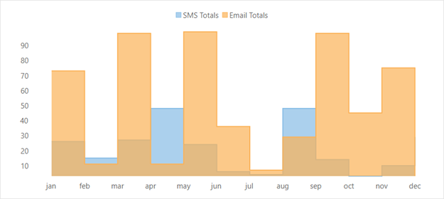
Bar charts compare categorical data through the horizontal bars, where length of each bar represents the value of the corresponding category. Y-axis in these charts is a category axis. Bar charts can be either grouped or stacked.
These charts are commonly used to visually represent data that is grouped into discrete categories, for example: age groups, months, etc.
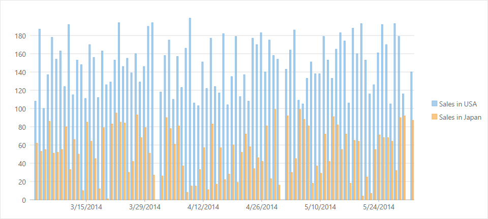
are simply vertical version of bar charts and they use X- axis as a category axis. Though bar charts and column charts can be used interchangeably, column charts are preferred where number of values is too large to be accommodated on an X-axis while bar charts are preferred in the case of long category titles which are difficult to fit on an X-axis or in the case of large number of categories. Column charts can be either grouped or stacked.
These charts are commonly used to visually represent data that is grouped into discrete categories, for example: age groups, months, etc.
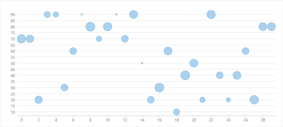
A Bubble chart represents three dimensions of data. The X and Y values denote two of the data dimensions. The third dimension is denoted by the size of the bubble.
These charts are used to compare entities based on their relative positions on the axis as well as their size.
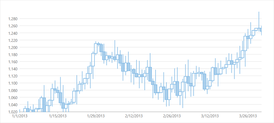
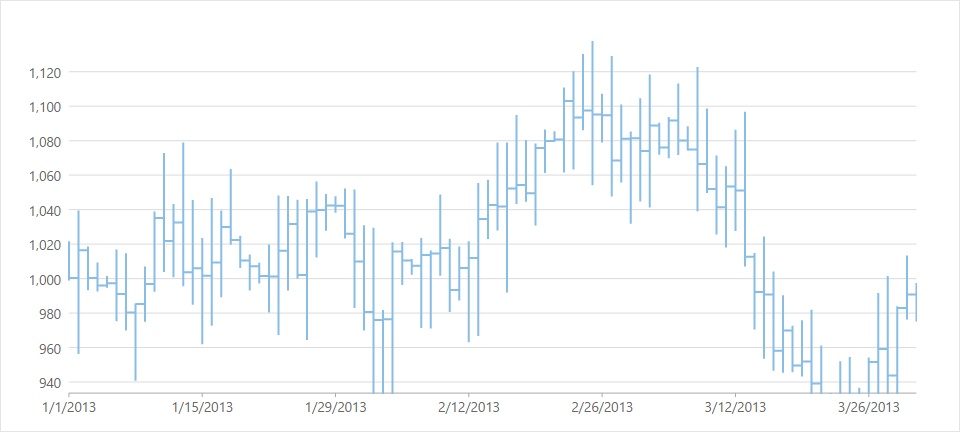
A Candlestick chart is a financial chart that shows the opening, closing, high and low prices of a given stock. It is a special type of HiLoOpenClose chart that is used to show the relationship between open and close as well as high and low. Candle chart uses price data (high, low, open, and close values) and it includes a thick candle-like body that uses the color and size of the body to reveal additional information about the relationship between the open and close values. for example:, long transparent candles show buying pressure and long filled candles show selling pressure.
Elements of a Candlestick chart
The Candlestick chart is made up of the following elements: candle, wick, and tail.
In a Candlestick there are five values for each data point in the series.
The following image shows a candlestick chart displaying stock prices.
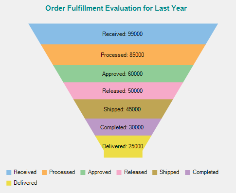
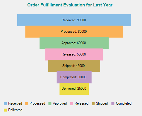
A funnel chart allows you to represent sequential stages in a linear process. For instance, a sales process that tracks prospects across the stages, such as Sales Prospects, Qualified Prospects, Price Quotes, Negotiations, and Closed Sales. In the process, each stage represents a proportion (percentage) of the total. Therefore, the chart takes the funnel shape with the first stage being the largest and each following stage smaller than the predecessor. Funnel charts are useful in identifying potential problem areas in processes where it is noticeable at what stages and rate the values decrease.
The following images show both Trapezoid and Stacked Bar charts displaying the number of orders across seven stages of an order fulfillment evaluation process.
 |
 |
|
Trapezoid Chart |
Stacked Bar Chart |
HiLoOpenClose are financial charts that combine four independent values to supply high, low, open, and close data for a point in a series. In addition to showing the high and low value of a stock, the Y2 and Y3 array elements represent the stock's opening and closing price, respectively.
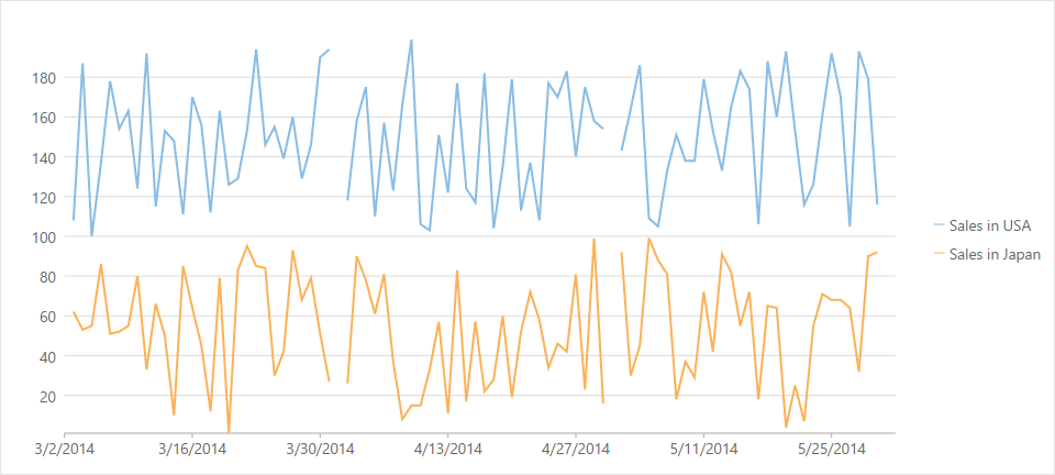
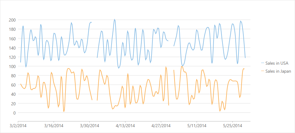
A Line chart draws each series as connected points of data, similar to area chart except that the area below the connected points is not filled. The series can be drawn independently or stacked.
These charts are commonly used to show trends and performance over time.
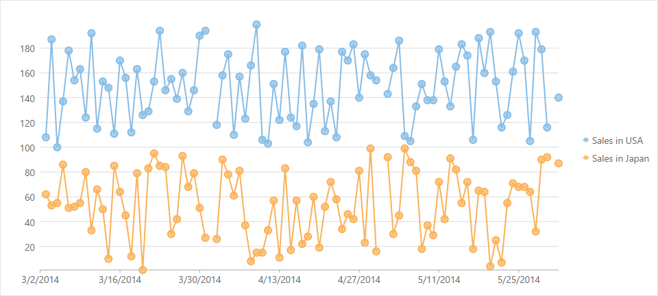
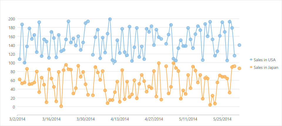
LineSymbol chart is similar to line chart except that it represents data points using symbols. It is the most effective way of denoting changes in value between different groups of data.
These charts are commonly used to show trends and performance over time.
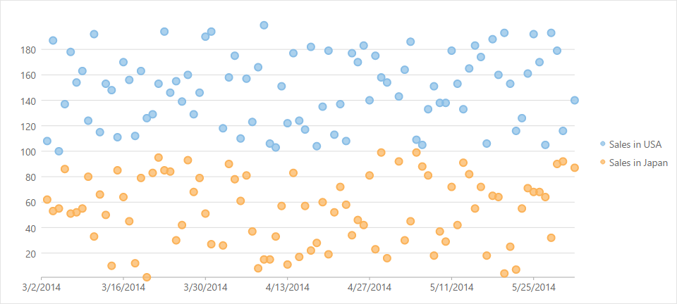
A Scatter chart represents a series in the form of points plotted using their X and Y axis coordinates. The X and Y axis coordinates are combined into single data points and displayed in uneven intervals or clusters.
These charts are commonly used to determine the variation in data point density with varying x and y coordinates.
A Spline chart draws each series as connected points of data, similar to line chart except that the points are connected by a smooth curved line. There are no sharp corners or abrupt changes in the tightness of the curve.
These charts are commonly used to plot data such as product life cycle, that requires the use of curve-fittings.
SplineArea charts are spline charts that display the area below the spline filled with color. SplineArea chart is similar to Area chart as both the charts show area, except that SplineArea chart uses splines and Area chart uses lines to connect data points.
SplineSymbol chart is similar to spline chart except that it represents data points using symbols. It is the most effective way of denoting changes in value between different groups of data.
These charts are commonly used to plot data such as product life cycle, that requires the use of curve-fittings.
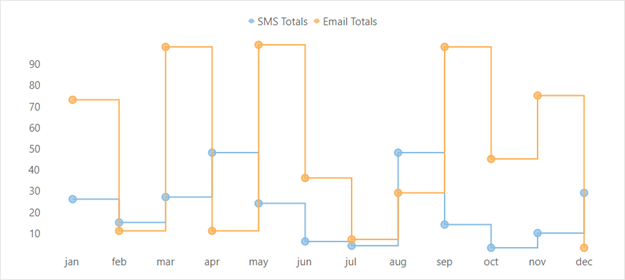
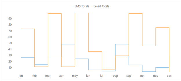
Step charts use vertical and horizontal lines to connect the data points to form a step-like progression. These charts are generally used to demonstrate the sudden change in data that might occur on irregular intervals and remains constant till the next change. These charts can be used to plot the change in commodity prices, change in tax rate against income etc.
Step Area chart is a modification of step chart where area between step chart and axis is filled with a color or shading to indicate the magnitude of change.
Step Symbols chart is a slight variation of step chart and is displayed with markers on the data points. These charts are used when it is required to know the exact data points which have been used to plot the chart.