You can change the type of the FinancialChart control depending on your requirement. Chart type can be changed by setting the ChartType property of the FinancialChart control. In this case, if multiple series are added to the FinancialChart, all of them are of the same chart type.
Here is a list of the types of financial charts:
| Razor |
Copy Code
|
|---|---|
.ChartType(C1.Web.Mvc.Finance.ChartType.Renko) |
|
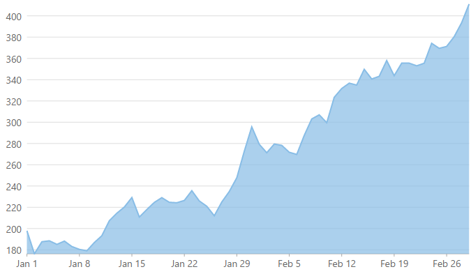
An Area chart draws each series as connected points of data and the area below the connected points is filled with color to denote volume. Each new series is drawn on top of the preceding series. The series can either be drawn independently or stacked.
These charts are commonly used to show trends between associated attributes over time.
Arms CandleVolume charts are a combination of EquiVolume and CandleVolume charts.
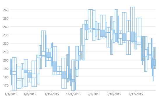
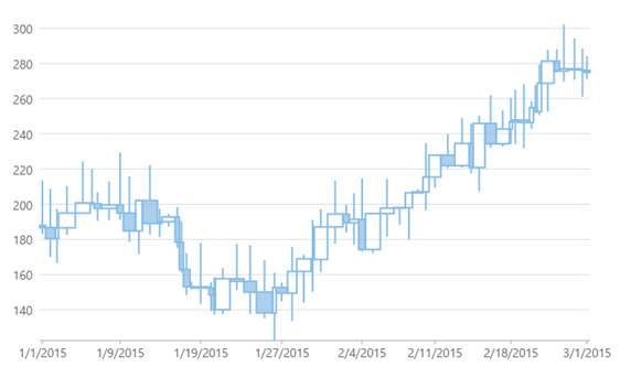
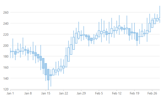
A Candlestick chart is a financial chart that shows the opening, closing, high and low prices of a given stock. It is a special type of HiLoOpenClose chart that is used to show the relationship between open and close as well as high and low. Candle chart uses price data (high, low, open, and close values) and it includes a thick candle-like body that uses the color and size of the body to reveal additional information about the relationship between the open and close values. for example:, long transparent candles show buying pressure and long filled candles show selling pressure.
Elements of a Candlestick chart
The Candlestick chart is made up of the following elements: candle, wick, and tail.
In a Candlestick there are five values for each data point in the series.
The following image shows a candlestick chart displaying stock prices.
CandleVolume charts are identical to standard Candlestick charts. The only difference is that the Volume determines the width of each bar in CandleVolume charts.
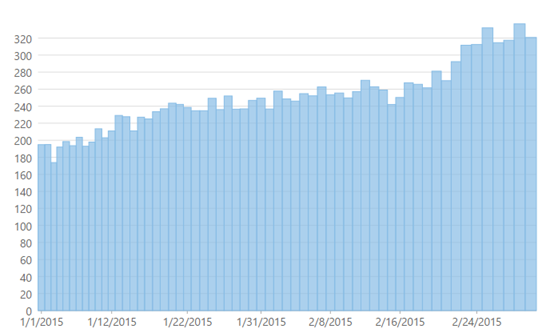
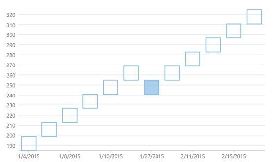
A Column chart represents each series in the form of bars of the same color and width, whose length is determined by its value. Each new series is plotted in the form of bars next to the bars of the preceding series. In a column chart, bars are arranged vertically. Column charts can be either grouped or stacked.
These charts are commonly used to visually represent data that is grouped into discrete categories, for example: age groups, months, etc.
ColumnVolume charts are similar to Column charts, but width in these charts are determined by Volume value.
EquiVolume charts are similar to candlestick charts, but the candlesticks in these charts are replaced with rectangular boxes of varying width (and no wicks). An EquiVolume box includes high and low price components with a third dimension, Volume that determines the width of each box. Color represents whether the close number is higher or lower than the previous box's close.
To know more about EquiVolume charts, read at StockCharts.com.
Heikin-Ashi charts are a variation of Japanese candlestick charts designed to remove noise from candlesticks and behave like a moving average. Heikin-Ashi charts are similar to Candlestick charts, but the method to calculate and plot candles on the chart is different for Heikin-Ashi. Each candle in Heikin-Ashi chart uses information presented by the previous candle. These charts are easier to read and interpret data.
These charts can be used to identify trends, potential reversal points, and other technical analysis patterns.
To know more about Heikin-Ashi charts, refer to What is Heikin-Ashi and How to Trade With It.
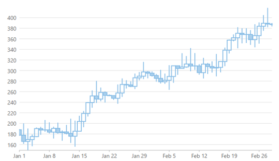
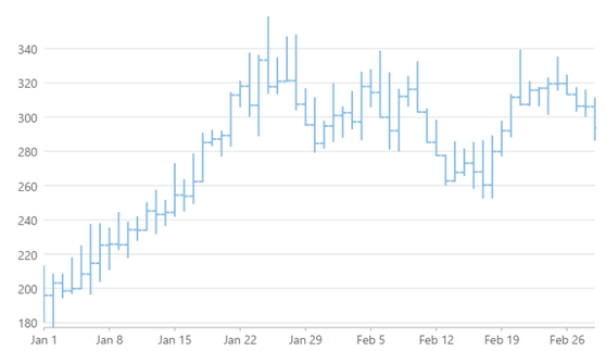
HiLoOpenClose are financial charts that combine four independent values to supply high, low, open, and close data for a point in a series. In addition to showing the high and low value of a stock, the Y2 and Y3 array elements represent the stock's opening and closing price, respectively.
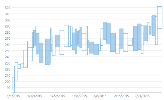
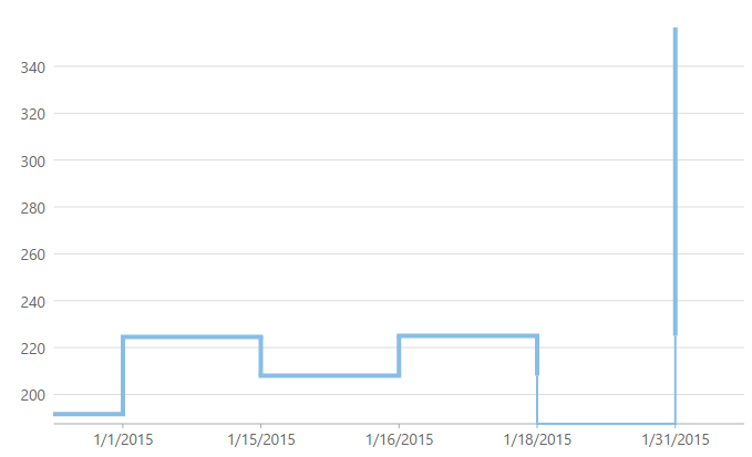
A Kagi chart displays supply and demand trends using a sequence of linked vertical lines. The thickness and direction of the lines vary depending on the price movement. If closing prices go in the direction of the previous Kagi line, then that Kagi line is extended. However, if the closing price reverses by the preset reversal amount, a new Kagi line is charted in the next column in the opposite direction. Thin lines indicate that the price breaks the previous low (supply) while thick lines indicate that the price breaks the previous high (demand).
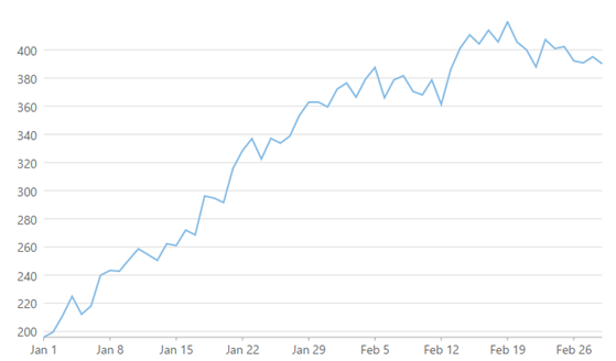
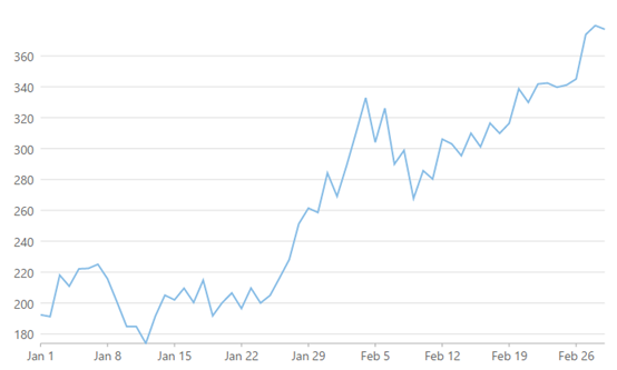
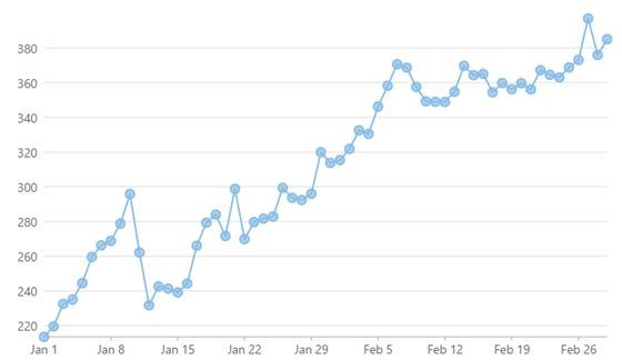
A Line chart draws each series as connected points of data, similar to area chart except that the area below the connected points is not filled. The series can be drawn independently or stacked.
These charts are commonly used to show trends and performance over time.
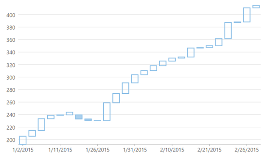
A Line Break or Three Line Break chart uses vertical boxes or lines to illustrate the price changes of an asset or market.
Movements are depicted with box colors and styles; movements that continue the trend of the previous box are colored similarly while movements that trend oppositely are indicated with a different color and/or style. The opposite trend is only drawn if its value exceeds the extreme value of the previous n number of boxes or lines, which is determined by the newLineBreaks option.
LineSymbol chart is similar to line chart except that it represents data points using symbols. It is the most effective way of denoting changes in value between different groups of data.
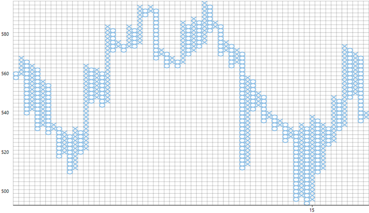
Point and Figure chart defines price trends through columns of stacked Xs or Os. Unlike time based charts, these charts focus on price movements alone without considering time. While Xs represent rising prices, Os represent falling prices.
You can specify box size, which is the value represented by each X and O. An increase in price, by the amount equal to box size, is recorded by an X. Further increase is recorded by another X stacked above it and so on. Whereas to show an opposite trend, the fall in price by the magnitude of box size is recorded by an O in the new column. It is tedious to record every price change, therefore you can set reversal amount to specify the minimum Xs or Os in a column before a price reversal is recorded. Price reversals occurring before the specified reversal amount are ignored.
FinancialChart supports Traditional, Fixed and Dynamic scaling in Point and Figure chart. While, Traditional scaling uses predefined table of price ranges provided by ChartCraft to determine box size, Fixed scaling allows end users to specify a box size and Dynamic scaling uses the calculated ATR value as box size.
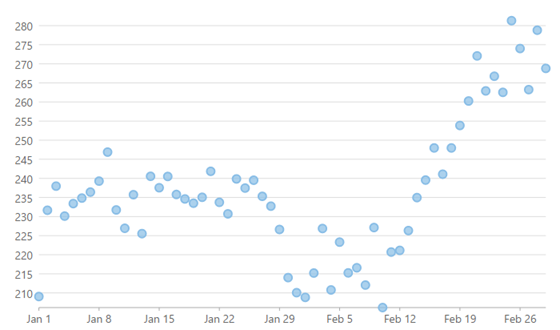
A Scatter chart represents a series in the form of points plotted using their X and Y axis coordinates. The X and Y axis coordinates are combined into single data points and displayed in uneven intervals or clusters.
These charts are commonly used to determine the variation in data point density with varying x and y coordinates.