FlexGrid gives end users the flexibility to group and ungroup grid data as per the requirement. This is supported by Group Panel control, which provides drag and drop grouping UI to the grid. It enables you to drag desired columns from the FlexGrid into the panel for grouping.
You can easily move groups within the panel to change the grouping order of the grid data. Moreover, clicking a group marker in the panel enables sorting of the groups, based on the particular column entries.
Use MaxGroups property to set the maximum number of groups you want to allow in Group Panel. Set the Placeholder property to the string you want to display in the panel when it contains no groups. Set the HideGroupedColumns property to a Boolean value, to specify whether you want to hide the grouped columns from the grid.
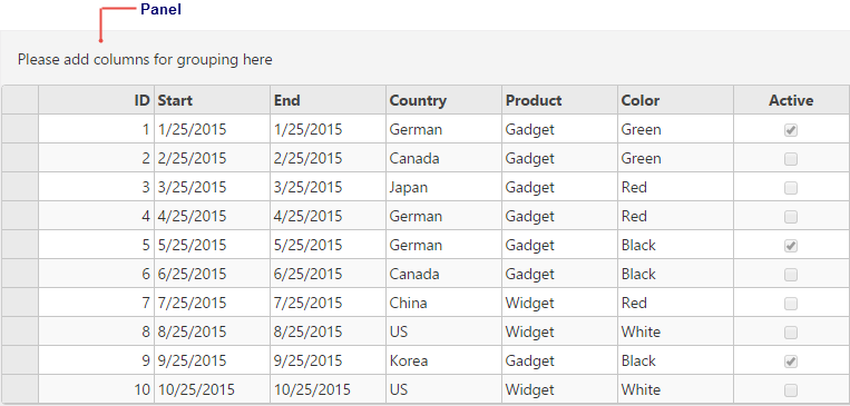
The following image shows how the FlexGrid appears on using Group Panel. The example uses Sale.cs model added in the Quick Start Section.
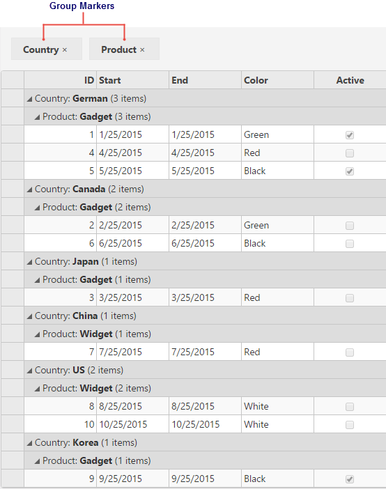
The following image shows how the FlexGrid appears on adding groups to the panel, at the top of the grid.
The following code examples demonstrate how to enable Group Panel in the FlexGrid:
GroupPanelController.cs
| C# |
Copy Code
|
|---|---|
public ActionResult GroupPanel(FormCollection data) { return View(Sale.GetData(10)); } |
|
GroupPanel.cshtml
| HTML |
Copy Code
|
|---|---|
@using C1.Web.Mvc.Grid @using TagFlexGrid.Models @model IEnumerable<Sale> <c1-flex-grid id="ovFlexGrid" auto-generate-columns="false" is-read-only="true" class="grid"> <c1-flex-grid-column binding="ID"></c1-flex-grid-column> <c1-flex-grid-column binding="Start"></c1-flex-grid-column> <c1-flex-grid-column binding="End"></c1-flex-grid-column> <c1-flex-grid-column binding="Country"></c1-flex-grid-column> <c1-flex-grid-column binding="Product"></c1-flex-grid-column> <c1-flex-grid-column binding="Color"></c1-flex-grid-column> <c1-flex-grid-column binding="Active"></c1-flex-grid-column> <c1-items-source read-action-url="@Model"></c1-items-source> <c1-flex-grid-group-panel max-groups="4" placeholder="Please add columns for grouping here" hide-grouped-columns(false)> </c1-flex-grid-group-panel> </c1-flex-grid> |
|
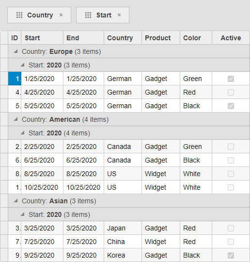
In addition to creating groups using the GroupPanel, FlexGrid also allows you to create group descriptions by dragging columns into the group. This can be achieved using GroupDescriptionCreator property of the FlexGridGroupPanel class, which sets the creator function for creating group descriptions.
For example, the following code uses the GroupDescriptionCreator property to set the customGroup function for creating group description. Here, the customGroup function groups "Start" and "End" columns by year and "Country" column by continent. The example uses Sale.cs model added in the Quick Start Section.
| GroupDescriptionCreatorController.cs |
Copy Code
|
|---|---|
public IActionResult Index() { return View(Sale.GetData(15)); } |
|
| Index.cshtml |
Copy Code
|
|---|---|
@model IEnumerable<Sale> <script type="text/javascript"> var europe = ["UK", "France", "German", "Italy"], american = ["US", "Canada"], asian = ["Japan", "China", "Korea"], autralian = ["Australia"]; function customGroup(prop) { switch (prop) { case 'Start': case 'End': return new wijmo.collections.PropertyGroupDescription(prop, (item, prop) => { return wijmo.Globalize.formatDate(item[prop], 'yyyy'); }); break; case 'Country': return new wijmo.collections.PropertyGroupDescription(prop, (item, prop) => { if (europe.includes(item.Country)) { return "Europe"; } else if (american.includes(item.Country)) { return "American"; } else if (asian.includes(item.Country)) { return "Asian"; } else { return "Australian"; } }); break; } } </script> <c1-flex-grid id="ovFlexGrid" auto-generate-columns="false" is-read-only="true" class="grid"> <c1-flex-grid-column binding="ID"></c1-flex-grid-column> <c1-flex-grid-column binding="Start"></c1-flex-grid-column> <c1-flex-grid-column binding="End"></c1-flex-grid-column> <c1-flex-grid-column binding="Country"></c1-flex-grid-column> <c1-flex-grid-column binding="Product"></c1-flex-grid-column> <c1-flex-grid-column binding="Color"></c1-flex-grid-column> <c1-flex-grid-column binding="Active"></c1-flex-grid-column> <c1-items-source source-collection="@Model"></c1-items-source> <c1-flex-grid-group-panel max-groups="@(Convert.ToInt32(4))" placeholder="Please add columns for grouping here" hide-grouped-columns="@(Convert.ToBoolean(false))" group-description-creator="customGroup"> </c1-flex-grid-group-panel> </c1-flex-grid> |
|