Trendlines are used to represent trends in data and to examine problems of prediction. Trendlines are commonly used with price charts or financial charts, but they can also be used with a variety of technical analysis charts such as MACD (moving average convergence/divergence) which is a trading indicator used in technical analysis of stock prices, or RSI (relative strength index) which is a technical indicator used in the analysis of financial markets.
Types of Trendlines
The following table displays the supported FitTypes. Each trend type is drawn based on the calculation formula of its type.
|
Type |
Description |
|---|---|
| Average X | Calculates the average value of X from the chart data and draws a trendline. |
| Average Y | Calculates the average value of Y from the chart data and draws a trendline. |
| Exponential | A curved line that is convenient to use when data values rise or fall at increasingly higher rates. You cannot create an exponential trendline if your data contains zero or negative values. |
| Fourier | A way to display a wave like function as a combination of simple sine waves. It is created by using the fourier series formula. |
| Linear | A linear trendline is a best-fit straight light. Your data is linear if the data point pattern resembles a line, and a linear trendline is a good fit if the R-squared value is at or near 1. |
| Logarithmic | A best fit curved line used for better visualization of data. Used when the rate of change in the data increases or decreases quickly and then levels out. It can also use positive and negative values. |
| Max X | Takes the maximum value of X from the chart and draws a trendline using it. |
| Max Y | Takes the maximum value of Y from the chart and draws a trendline using it. |
| Min X | Takes the minimum value of X from the chart and draws a trendline using it. |
| Min Y | Takes the minimum value of Y from the chart and draws a trendline using it |
| Polynomial | A twisted line that is used when data oscillates. It is useful for analyzing gains and losses over a large data set. |
| Power | A curved line that is best used with data sets that compare calculation that increase at a peculiar rate. For example, the acceleration of a vehicle at one-second intervals. |
You can add trendlines to your charts to display trends of data. Using this, you can easily analyze the increase or decrease of your Y data over your X data.
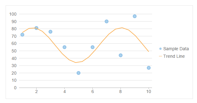
The image below shows how trendline, with FitType set to Fourier, appears on the FlexChart.
The following code example demonstrates how to add a trendline to the FlexChart. This example uses the sample created in the Quick Start section.
| Example Title |
Copy Code
|
|---|---|
@model List<MathPoint> <c1-flex-chart binding-x="Name"chart-type="ChartType.Scatter" legend-position="Position.Right" width="600px" height="300px" legend-toggle="true"> <c1-items-source source-collection="Model"></c1-items-source> <c1-flex-chart-series binding="Y" name="Sales in USA"></c1-flex-chart-series> <c1-flex-chart-trendline binding="Y" name="Trend Line" sample-count="20" trend-line-order="3" fit-type="TrendLineFitType.Fourier"> </c1-flex-chart-trendline> </c1-flex-chart> |
|