You can add tooltips to the FlexGrid column headers. FlexGrid can be used in conjunction with Wijmo's Tooltip control to display data when you hover the mouse cursor over column headers in the FlexGrid control.
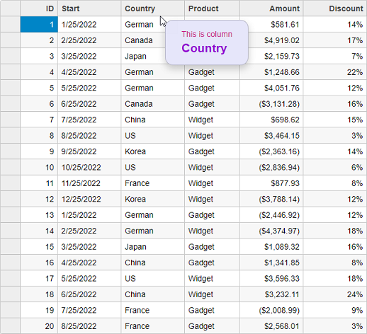
Following example shows how you can bind Tooltips to the column headers of FlexGrid control. The example uses Sale.cs model which was added to the application in the Quick Start topic:
| HeaderTooltipController.cshtml |
Copy Code
|
|---|---|
public IActionResult Index() { var model = Sale.GetData(20); return View(model); } |
|
| HeaderTooltip.razor |
Copy Code
|
|---|---|
@model IEnumerable<Sale>

<style>
    .hdr-tip {
        background: lavender;
        color: mediumvioletred;
        padding: 1em 2em;
        margin: .5em;
        border-radius: 1em;
    }

        .hdr-tip .col-header {
            color: darkviolet;
            font-weight: bold;
            font-size: 150%;
        }
</style>

<script type="text/javascript">
    var hdrTips;
    c1.documentReady(function () {
        // Column header tooltips
        hdrTips = new wijmo.Tooltip({
            position: wijmo.PopupPosition.RightTop,
            showAtMouse: true,
            showDelay: 600,
            cssClass: 'hdr-tip'
        });
    });

    function formatItem(panel, r, c, cell) {
        if (panel.cellType == wijmo.grid.CellType.ColumnHeader) {
            hdrTips.setTooltip(cell, 'This is column<br/>' +
                '<span class="col-header">' + panel.columns[c].header + '</span>');
        }
    }
    function loadingRows() {
        if (hdrTips) {
            hdrTips.dispose();
        }
    }
</script>

<c1-flex-grid auto-generate-columns="false" class="grid"
              is-read-only="true" item-formatter="formatItem" loading-rows="loadingRows">
    <c1-items-source source-collection="@Model"></c1-items-source>
    <c1-flex-grid-column binding="ID"></c1-flex-grid-column>
    <c1-flex-grid-column binding="Start"></c1-flex-grid-column>
    <c1-flex-grid-column binding="Country"></c1-flex-grid-column>
    <c1-flex-grid-column binding="Product"></c1-flex-grid-column>
    <c1-flex-grid-column binding="Amount" format="c"></c1-flex-grid-column>
    <c1-flex-grid-column binding="Discount" format="p0"></c1-flex-grid-column>
</c1-flex-grid>
|
|