The Accordion control allows you to organize content into collapsible panes so that you can choose to show or hide the content in the panes according to your requirements. By expanding the accordion panes, you can access their content and work with them. By collapsing the accordion panes, you can temporarily deny access to their content, save space and avoid scrolling. Let us explore how you can expand or collapse accordion pane(s) programmatically.
By default, the Accordion control expands only one pane at a time and collapses the other panes. However, you can change this behavior of the accordion panes by setting AllowExpandMany property of the Accordion class to True.
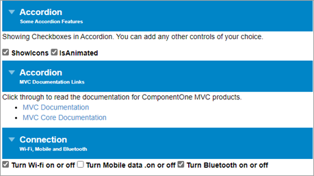
The following code demonstrates how you can allow a user to expand multiple panes at a time in the Accordion control programmatically.
| Index.cshtml |
Copy Code
|
|---|---|
<style>
        /* styling to reduce font-size for Accordion's description */
        .wj-accordion .wj-header .tab-desc {
            font-size: 10px;
        }

        .wj-accordion .wj-header.wj-state-active {
            background: green;
        }

        .wj-accordion > .wj-header:focus {
            outline: 2px solid #0085c7;
            outline-offset: -2px;
        }

        .wj-accordion > .wj-header.wj-state-active {
            background: #0085c7;
            color: white;
        }
</style>
<!-- Accordion Host Element -->
<c1-accordion id="accordion" allow-expand-many="true" >
    <!-- Accordion Pane Wrapper-->
    <div>
        <div>
            Accordion
            <div class="tab-desc">
                Some Accordion Features
            </div>
        </div>
        <div>
            <p>Showing Checkboxes in Accordion. You can add any other controls of your choice.</p>
            <input id="showIcons" type="checkbox" checked />
            <label for="showIcons">
                ShowIcons
            </label>
            <input id="isAnimated" type="checkbox" checked />
            <label for="isAnimated">
                IsAnimated
            </label>

        </div>
    </div>
    <div>
        <!-- Accordion Pane Header-->
        <div>
            Accordion
            <!-- Short  description for Accordion Pane Header-->
            <div class="tab-desc">
                MVC Documentation Links
            </div>
        </div>
        <!-- Accordion Pane Content-->
        <div>
            Click through to read the documentation for ComponentOne MVC products.
            <ul>
                <li><a href="https://developer.mescius.com/componentone/docs/mvc/online-mvc/overview.html" target="_blank">MVC Documentation</a></li>
                <li><a href="https://developer.mescius.com/componentone/docs/mvc/online-mvc-core/overview.html" target="_blank">MVC Core Documentation</a></li>
            </ul>
        </div>

    </div>
    <div>
        <!-- pane -->
        <div>
            <!-- header -->
            Connection
            <div class="tab-desc">
                Wi-Fi, Mobile and Bluetooth
            </div>
        </div>
        <div>
            <!-- content -->
                <input id="wifi" type="checkbox" checked />
                <label for="wifi">
                    <span>Turn Wi-fi on or off</span>
                </label>


                <input id="mobiledata" type="checkbox" />
                <label for="mobiledata">
                    <span>Turn Mobile data .on or off</span>
                </label>


                <input id="bluetooth" type="checkbox" checked />
                <label for="bluetooth">
                    <span>Turn Bluetooth on or off</span>
                </label>
        </div>
    </div>
</div>
</c1-accordion>

    <script>
        c1.documentReady(function () {
            let acc = wijmo.Control.getControl("#accordion");
            link(acc, 'showIcons');
            link(acc, 'isAnimated');
        });
        function link(acc, id) {
            let cb = document.getElementById(id);
            acc[id] = cb.checked;
            cb.addEventListener('click', function(e) {
                acc[id] = cb.checked;
            });
        }
    </script>
|
|
In addition to displaying all the panes in expanded state, Accordion allows you to collapse all its panes at once. For doing so, you need to set AllowCollapseAll property of the Accordion class to True. This is useful in cases where you want to conserve screen real estate so that the user is free of unnecessary distractions.
The following code demonstrates how you can allow a user to collapse all the panes in the Accordion control programmatically.
| Index.cshtml |
Copy Code
|
|---|---|
<style>
        /* styling to reduce font-size for Accordion's description */
        .wj-accordion .wj-header .tab-desc {
            font-size: 10px;
        }

        .wj-accordion .wj-header.wj-state-active {
            background: green;
        }

        .wj-accordion > .wj-header:focus {
            outline: 2px solid #0085c7;
            outline-offset: -2px;
        }

        .wj-accordion > .wj-header.wj-state-active {
            background: #0085c7;
            color: white;
        }
    </style>

<!-- Accordion Host Element -->
<c1-accordion id="accordion" allow-collapse-all="true">
    <!-- Accordion Pane Wrapper-->
    <div>
        <div>
            Accordion
            <div class="tab-desc">
                Some Accordion Features
            </div>
        </div>
        <div>
            <p>Showing Checkboxes in Accordion. You can add any other controls of your choice.</p>
            <input id="showIcons" type="checkbox" checked />
            <label for="showIcons">
                ShowIcons
            </label>
            <input id="isAnimated" type="checkbox" checked />
            <label for="isAnimated">
                IsAnimated
            </label>

        </div>
    </div>
    <div>
        <!-- Accordion Pane Header-->
        <div>
            Accordion
            <!-- Short  description for Accordion Pane Header-->
            <div class="tab-desc">
                MVC Documentation Links
            </div>
        </div>
        <!-- Accordion Pane Content-->
        <div>
            Click through to read the documentation for ComponentOne MVC products.
            <ul>
                <li><a href="https://developer.mescius.com/componentone/docs/mvc/online-mvc/overview.html" target="_blank">MVC Documentation</a></li>
                <li><a href="https://developer.mescius.com/componentone/docs/mvc/online-mvc-core/overview.html" target="_blank">MVC Core Documentation</a></li>
            </ul>
        </div>

    </div>
    <div>
        <!-- pane -->
        <div>
            <!-- header -->
            Connection
            <div class="tab-desc">
                Wi-Fi, Mobile and Bluetooth
            </div>
        </div>
        <div>
            <!-- content -->
                <input id="wifi" type="checkbox" checked />
                <label for="wifi">
                    <span>Turn Wi-fi on or off</span>
                </label>


                <input id="mobiledata" type="checkbox" />
                <label for="mobiledata">
                    <span>Turn Mobile data .on or off</span>
                </label>


                <input id="bluetooth" type="checkbox" checked />
                <label for="bluetooth">
                    <span>Turn Bluetooth on or off</span>
                </label>
        </div>
    </div>
</div>
</c1-accordion>

    <script>
        c1.documentReady(function () {
            let acc = wijmo.Control.getControl("#accordion");
            link(acc, 'showIcons');
            link(acc, 'isAnimated');
        });
        function link(acc, id) {
            let cb = document.getElementById(id);
            acc[id] = cb.checked;
            cb.addEventListener('click', function(e) {
                acc[id] = cb.checked;
            });
        }
    </script>
|
|
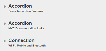
By default, all the panes are collapsed in the Accordion control, at runtime. However, you can choose to expand any pane in the Accordion control according to your application requirements. For expanding any pane, you simply need to set its IsCollapsed property to false.
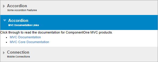
In the following code, we have set the IsCollapsed property to false for the second pane in the Accordion control to display the content in the second pane and hide the content in the other panes.
| Index.cshtml |
Copy Code
|
|---|---|
<style>
/* to reduce font-size for Accordion's description */
.wj-accordion .wj-header .tab-desc {
font-size: 10px;
}
</style>
<div>
<!-- Accordion Pane Wrapper-->
<div>
<!-- Accordion Pane Header-->
<div id="headerCollapsedPane">
Accordion
<!-- Short description for Accordion Pane Header-->
<div class="tab-desc">
Some Accordion Features
</div>
</div>
<!-- Accordion Pane Content-->
<div id="contentCollapsedPane">
<!-- content -->
<p>Showing Checkboxes in Accordion.</p>
<input id="showIcons" type="checkbox" checked />
<label for="showIcons">
ShowIcons
</label>
<input id="isAnimated" type="checkbox" checked />
<label for="isAnimated">
IsAnimated
</label>
</div>
</div>
<div>
<!-- Accordion Pane Header-->
<div id="headerNonCollapsedPane">
Accordion
<!-- Short description for Accordion Pane Header-->
<div class="tab-desc">
MVC Documentation Links
</div>
</div>
<!-- Accordion Pane Content-->
<div id="contentNonCollapsedPane">
<!-- content -->
Click through to read the documentation for ComponentOne MVC products.
<ul>
<li><a href="https://developer.mescius.com/componentone/docs/mvc/online-mvc/overview.html" target="_blank">MVC Documentation</a></li>
<li><a href="https://developer.mescius.com/componentone/docs/mvc/online-mvc-core/overview.html" target="_blank">MVC Core Documentation</a></li>
</ul>
</div>
</div>
<div>
<!-- Accordion Pane Header-->
<div id="collapsedPaneHeader">
Connection
<!-- Short description for Accordion Pane Header-->
<div class="tab-desc">
Mobile Connections
</div>
</div>
<!-- Accordion Pane Content-->
<div id="collapsedPaneContent">
<!-- content -->
<p>Showing mobile connections in Accordion.</p>
<input id="wifi" type="checkbox" checked />
<label for="wifi">
Wi-Fi <span>Turn Wi-fi on or off</span>
</label>
<input id="mobiledata" type="checkbox" />
<label for="mobiledata">
Mobile Data <span>Turn Mobile data on or off</span>
</label>
<input id="bluetooth" type="checkbox" checked />
<label for="bluetooth">
Bluetooth <span>Turn Bluetooth on or off</span>
</label>
<input id="hotspot" type="checkbox" />
<label for="hotspot">
Hot Spot & Tethering <span>Hotspot on, Tethering</span>
</label>
</div>
</div>
</div>
<c1-accordion id="accordion">
<c1-accordion-pane header="#headerCollapsedPane" content="#contentCollapsedPane" is-collapsed="true"></c1-accordion-pane>
<c1-accordion-pane header="#headerNonCollapsedPane" content="#contentNonCollapsedPane" is-collapsed="false"></c1-accordion-pane>
<c1-accordion-pane header="#collapsedPaneHeader" content="#collapsedPaneContent" is-collapsed="true"></c1-accordion-pane>
</c1-accordion>
@section Scripts{
<script>
c1.documentReady(function () {
let acc = wijmo.Control.getControl("#accordion");
link(acc, 'showIcons');
link(acc, 'isAnimated');
});
function link(acc, id) {
let cb = document.getElementById(id);
acc[id] = cb.checked;
cb.addEventListener('click', function (e) {
acc[id] = cb.checked;
});
}
</script>
}
|
|