The C1DropDownButton control is similar to the C1DropDown control and consists of two parts: a header area and a content area. The header appears visible when the drop-down box is not open; the content is what is visible when the drop-down area is clicked. For example, in the below image the content area concludes a structured menu:
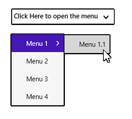
You can add content to neither, either, or both the header and content areas. You can customize the C1DropDown control in XAML by adding content to the header and content areas. For example the following markup creates a drop-down control similar to the one pictured above:
| Markup |
Copy Code
|
|---|---|
<Xaml:C1DropDownButton x:Name="ddl" Header="Click Here to open the menu" HorizontalAlignment="Left" Xaml:C1NagScreen.Nag="True" Margin="451,301,0,391" Grid.Row="1"> <Xaml:C1MenuList> <Xaml:C1MenuItem Header="Menu 1"> <Xaml:C1MenuItem Header="Menu 1.1" /> </Xaml:C1MenuItem> <Xaml:C1MenuItem Header="Menu 2" /> <Xaml:C1MenuItem Header="Menu 3" /> <Xaml:C1MenuItem Header="Menu 4" /> </Xaml:C1MenuList> </Xaml:C1DropDownButton> |
|
Note that the header text is defined in the <c1:C1DropDownButton> tag and the content is placed within the <c1:C1DropDownButton></c1:C1DropDownButton> tags.