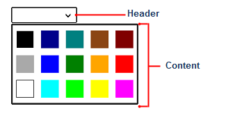
The C1DropDown control consists of two parts: a header area and a content area. The header appears visible when the drop-down box is not open; the content is what is visible when the drop-down area is clicked. In the image below, the two sections are identified:
You can add content to neither, either, or both the header and content areas. You can customize the C1DropDown control in XAML by adding content to the header and content areas. For example, the following markup creates a drop-down control similar to the one pictured above:
| Markup |
Copy Code
|
|---|---|
<Xaml:C1DropDownButton Grid.Row="1" Background="White" x:Name="c1DropDown1" Padding="2" Width="150" HorizontalAlignment="Center" VerticalAlignment="Center" Xaml:C1NagScreen.Nag="True"> <Xaml:C1DropDownButton.Header> <Border x:Name="dropDownBorder" Background="White" /> </Xaml:C1DropDownButton.Header> <Xaml:C1DropDownButton.Content> <Xaml:C1TileListBox x:Name="colorListBox" Height="180" Orientation="Horizontal" ItemTapped="colorListBox_ItemTapped" SelectionMode="None" BorderBrush="{StaticResource ComboBoxPopupBorderThemeBrush}" BorderThickness="{StaticResource ComboBoxPopupBorderThemeThickness}" Background="{StaticResource ComboBoxPopupBackgroundThemeBrush}"> <Border Background="Black" BorderBrush="White" BorderThickness="1"/> <Border Background="DarkGray"/> <Border Background="White" BorderBrush="Black" BorderThickness="1"/> <Border Background="DarkBlue" /> <Border Background="Blue" /> <Border Background="Cyan" /> <Border Background="Teal" /> <Border Background="Green" /> <Border Background="Lime" /> <Border Background="SaddleBrown"/> <Border Background="Orange" /> <Border Background="Yellow" /> <Border Background="Maroon" /> <Border Background="Red" /> <Border Background="Magenta" /> </Xaml:C1TileListBox> </Xaml:C1DropDownButton.Content> </Xaml:C1DropDownButton> |
|
Note that the <Xaml:C1DropDown.Header> and <Xaml:C1DropDown.Content> tags are used to define header and content. You can add controls and content within these tags.