In This Topic
ColorPicker for UWP allows users to create customized, visually-advanced applications enriched with multi-color palettes. The following illustrations show various elements of a C1ColorPicker.
Basic Mode
The Mode property of C1ColorPicker allows users to either choose colors from a preselected color palette or customize their own palette as per their choice. C1ColorPicker supports three modes provided by C1ColorPickerMode, namely Basic, Advanced and Both. By default, the Mode property is set to Both with Basic as well as Advanced color palettes visible to users.
Basic Mode: By default, C1ColorPicker opens with Basic tab open when the control's drop-down arrow is clicked. The Basic Tab appears similar to the following image.
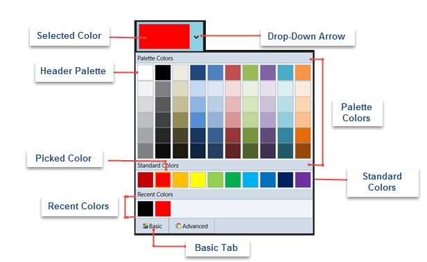
The Basic tab includes:
- Drop-Down Arrow: Click the drop-down arrow to open C1ColorPicker's window.
- Selected Color: The currently selected color appears the ColorPicker's window.
- Picked Color: The currently picked color appears with a highlighted border in the list of colors.
- Palette Color: Palette colors reflect the currently selected color palette. You can choose a palette by setting the Palette property.
- Header Palette: These colors are the basic colors available in the selected palette. The expanded list of palette colors are simply variations of these basic color tones.
- Standard Colors: Lists out ten standard colors, including dark brick red, red, orange, yellow, light green, green, sky blue, blue, navy blue and purple.
- Recent Colors: Lists up to ten recently used colors. You can choose to hide recent colors by setting the ShowRecentColors property to False.
Advanced Mode
The Advanced mode appears in the Advanced tab, which is placed on the right side of the Basic tab. This mode enables users to customize the color palette by selecting various color tones available with every single color. This mode also supports RGB Colors, which can be viewed in C1ColorPicker's Properties window in Design view. The Advanced tab appears similar to the following image.
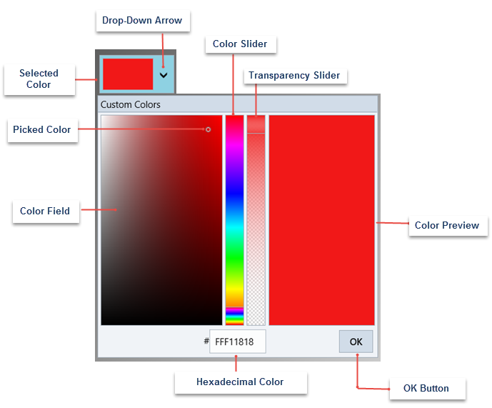
The Advanced tab mainly includes:
- Drop-Down Arrow: Click the drop-down arrow to open C1ColorPicker's window.
- Color Slider: Color slider lets you select color from the color spectrum. Move the Color Slider to pick a general color and then fine tune your selection in the Color Field.
- Color Field/Picked Color: The Color Field enables you to select a color tone. The Picked Color indicates the currently selected color.
- Transparency Slider: This slider allows you to set the color's transparency, which can be set to opaque or partially/completely transparent.
- Color Preview: This component enables you to preview the selected color.
- OK Button: Once you are satisfied with the color choice, click the OK button to close the drop down and set it as the selected color.
Additional Controls
C1SpectrumColorPicker: Colorpicker for UWP includes C1SpectrumColorPicker control that allows you to access the advanced color picking functionality. The C1SpectrumColorPicker appears similar to the following image.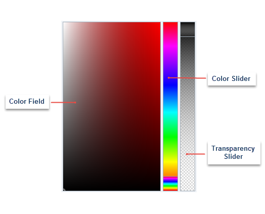
The C1SpectrumColorPicker control includes:
- Color Field: The Color Field enables you to select a color tone.
- Color Slider: Color slider lets you select color from the color spectrum. Move the Color Slider to pick a general color and then fine tune your selection in the Color Field.
- Transparency Slider: This slider allows you to set the color's transparency, which can be set to opaque or partially/completely transparent. This slider is visible only when the ShowAlphaChannel property is set to True (default).
C1HexColorBox: Colorpicker for UWP includes C1HexColorBox control for data validation of hexadecimal code entries. Similar to a regular textbox in appearance, C1HexColorBox control displays an 8-character code, wherein the first two characters represents the color's transparency level. For instance, FF represents opaque and 00 represents transparent. The remaining 6-characters represent standard hexadecimal color selection. C1HexColorBox appears similar to the following image.
