FlexPie provides various options to format data labels according to your requirements. You can use connecting lines to connect the data labels, set and style borders of data labels, and customize the appearance of data labels.
The topic comprises of three sections:
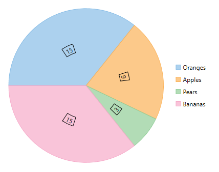
To add and style borders to FlexPie data labels, set the Border and BorderStyle properties provided by DataLabel class.
Use the following code snippet to add borders to data labels of FlexPie.
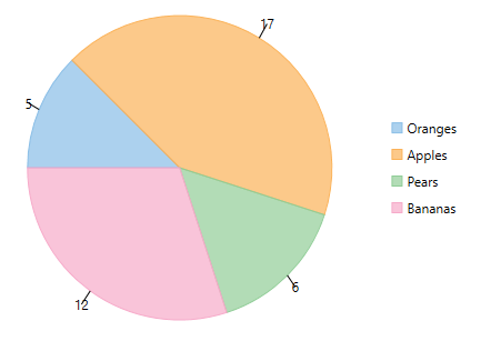
In case the data labels are placed away from the data points, you can connect them using connecting lines.
To enable connecting lines in FlexPie chart, you need to use the ConnectingLine property.
Use the following code snippet to set the connecting lines.
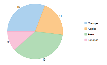
FlexPie includes various styling options, to enhance the clarity of data labels. To modify the appearance of FlexPie chart, you need to use the Style property. It allows you to modify the font family, fill color, use stroke brush for data labels, set width for stroke brush and more.
In the example code, we have modified the font used in the chart and set the stroke width property. Use the following code snippet to modify the appearance of the chart.