Most grids support row and column header cells, used to display a header over columns and to indicate the status of the row that contains the selection.
The C1FlexGrid takes this concept a little further and supports multi-cell headers. You could for example have two rows of column headers, one showing the year and one showing the quarter. Here's some code that shows how you could set that up:
| C# |
Copy Code
|
|---|---|
// add an extra column header row var ch = flexgrid1.ColumnHeaders; ch.Rows.Add(new Row()); // populate the header rows for (int c = 0; c < ch.Columns.Count; c++) { ch[0, c] = 2009 + c / 4; // row 0: year ch[1, c] = string.Format("Q {0}", c % 4 + 1); // row 1: quarter } |
|
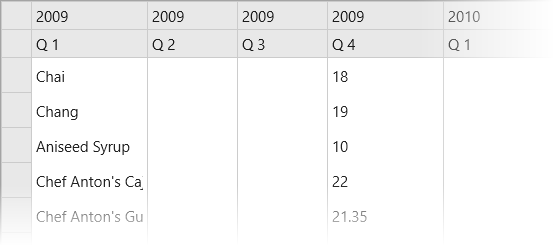
This code would produce a grid that looks like this:

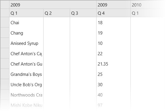
Notice the two rows used to display the column headers. You could achieve a similar effect in a traditional grid using column headers with line breaks. The difference becomes apparent when we add cell merging to the top fixed row, so columns that refer to the same year are automatically merged. It only takes two lines of code:
| C# |
Copy Code
|
|---|---|
// add an extra column header row var ch = flexgrid1.ColumnHeaders; ch.Rows.Add(new Row()); // populate the header rows for (int c = 0; c < ch.Columns.Count; c++) { ch[0, c] = 2009 + c / 4; // row 0: year ch[1, c] = string.Format("Q {0}", c % 4 + 1); // row 1: quarter } // merge the top fixed row flexgrid1.AllowMerging = AllowMerging.All; ch.Rows[0].AllowMerging = true; |
|
The result is displayed in the image below:
