InputPanel provides you the flexibility to create your own custom template to change the InputPanel layout according to your requirements. Creating a custom template provides you the ease of creating a form with compact UI and according to the application you are using it in. The control allows you to use DataTemplate to define a different layout and change the way the control appears.
The following image shows a custom template applied to the InputPanel control.
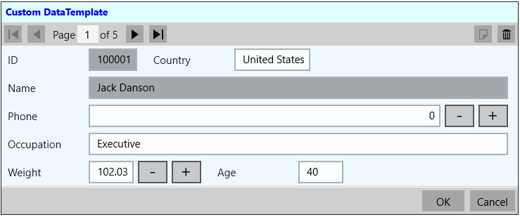
You can create a custom template using DataTemplate to change the layout of the control using the following steps. This example uses the sample created in Quick Start. In this example, a data template is created that contains a StackPanel comprising two StackPanels with horizontal orientation. These two inner StackPanels consists of the editors that are required to be aligned horizontally and the outer StackPanel consists of the editors that are to be aligned vertically. The InputPanel accesses this data template through ItemsSource property to customize the UI elements.
The example also showcases the customization of the InputPanel header template using the HeaderTemplate property of C1InputPanel class.
| XAML |
Copy Code
|
|---|---|
xmlns:c1="using:C1.Xaml" xmlns:c1input="using:C1.Xaml.InputPanel" |
|
| XAML |
Copy Code
|
|---|---|
<Page.Resources> <DataTemplate x:Key="InputPanelCustomDataTemplate"> <StackPanel Background="AliceBlue"> <StackPanel Orientation="Horizontal"> <c1input:C1InputTextBox Header="ID" DataBinding="{Binding ID, Mode=OneWay}" IsReadOnly="True" LabelForeground="{Binding LabelForeground, ElementName=InPanel}"></c1input:C1InputTextBox> <c1input:C1InputTextBox Header="Country" DataBinding="{Binding Country, Mode=TwoWay, UpdateSourceTrigger=PropertyChanged}" IsReadOnly="{Binding IsReadOnly, ElementName=InPanel}" LabelForeground="{Binding LabelForeground, ElementName=InPanel}"></c1input:C1InputTextBox> </StackPanel> <c1input:C1InputTextBox Header="Name" DataBinding="{Binding Name, Mode=OneWay}" IsReadOnly="True" LabelForeground="{Binding LabelForeground, ElementName=InPanel}"></c1input:C1InputTextBox> <c1input:C1InputNumericBox Header="Phone" DataBinding="{Binding Phone, Mode=TwoWay, UpdateSourceTrigger=PropertyChanged}" IsReadOnly="{Binding IsReadOnly, ElementName=InPanel}" LabelForeground="{Binding LabelForeground, ElementName=InPanel}"></c1input:C1InputNumericBox> <c1input:C1InputTextBox Header="Occupation" DataBinding="{Binding Occupation, Mode=TwoWay, UpdateSourceTrigger=PropertyChanged}" IsReadOnly="{Binding IsReadOnly, ElementName=InPanel}" LabelForeground="{Binding LabelForeground, ElementName=InPanel}"></c1input:C1InputTextBox> <StackPanel Orientation="Horizontal"> <c1input:C1InputNumericBox Header="Weight" DataBinding="{Binding Weight, Mode=TwoWay, UpdateSourceTrigger=PropertyChanged}" IsReadOnly="{Binding IsReadOnly, ElementName=InPanel}" LabelForeground="{Binding LabelForeground, ElementName=InPanel}"></c1input:C1InputNumericBox> <c1input:C1InputTextBox Header="Age" DataBinding="{Binding Age, Mode=TwoWay, UpdateSourceTrigger=PropertyChanged}" IsReadOnly="{Binding IsReadOnly, ElementName=InPanel}" LabelForeground="{Binding LabelForeground, ElementName=InPanel}"></c1input:C1InputTextBox> </StackPanel> </StackPanel> </DataTemplate> <ItemsPanelTemplate x:Key="ItemsPanel"> <StackPanel Orientation="Vertical" Margin="20"/> </ItemsPanelTemplate> </Page.Resources> |
|
| XAML |
Copy Code
|
|---|---|
<c1input:C1InputPanel x:Name="InPanel" AutoGenerate="False" ItemsPanelTemplate="{StaticResource ItemsPanel}" ItemsTemplate="{StaticResource InputPanelCustomDataTemplate}" HeaderBackground="LightCyan" HeaderFontWeight="Bold" Margin="20, 40, 150,340"><c1input:C1InputPanel.HeaderTemplate> <DataTemplate> <StackPanel> <TextBlock Text="Custom DataTemplate" Margin="6" Foreground="Blue" /> </StackPanel> </DataTemplate> </c1input:C1InputPanel.HeaderTemplate> </c1input:C1InputPanel> |
|