In This Topic
The C1Tile control is an animated headered content control that mimics the Windows 10 live tiles behavior. For example, the markup below creates a basic C1Tile control with several properties set:
| Markup |
Copy Code
|
<Tile:C1Tile Content="1" BackContent="1" Header="C1Tile" HeaderBackground="#22000000" HeaderPadding="12" Padding="0" BorderBrush="#FF356A21" BorderThickness="2" Background="#FFC410" Foreground="White" FontSize="80" HeaderForeground="White" HeaderFontSize="12" Width="280" Height="200"/>
|
The following image illustrates the result of the above markup, noting some of the set properties:
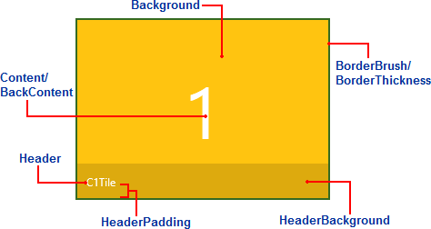
The following properties are set in the image/markup above:
- Content: This property sets the initial content of the C1Tile control. In the above image, Content is set to "1".
- BackContent: This sets the alternative content of the C1Tile control. In the above image, BackContent is also set to "1" (the same as Content). But if the BackContent property is set to another value, that value would appear when the tile's content changes.
- Header: This property sets the content of the C1Tile control's header. By default the header appears at the bottom of the tile, in the above image, Header is set to "C1Tile".
- HeaderBackground: This property sets the color and transparency of the header's background. In the above example, the HeaderBackground property is set to "22000000". The first two values indicate the transparency of the color; the last six values indicate that the color is black.
- HeaderPadding: The HeaderPadding property sets the padding around the Header value. In the above example, HeaderPadding is set to "12". The greater the number, the futher the value indicated by the Header property will appear from the edges of the tile.
- Padding: The Padding property sets the padding around the Content and Header within the tile. In the above example, Padding is set to "0". This indicates that the header area appears flush against the bottom border of the tile. The greater the number, the futher the values indicated by the Content and Header properties will appear from the edges of the tile.
- BorderBrush: The BorderBrush property indicates the color of the border around the C1Tile control. In the above example, this is set to "#FF356A21", an opaque green color.
- BorderThickness: The BorderThickness indicates the thickness of the border surrounding the C1Tile. In the above example, this property is set to "2".
For information about templates, see ContentTemplates and BackContentTemplates.
See Also