You can easily customize C1Carousel's appearance and behavior. In the following steps you'll set the control's behavior and appearance. The following steps assume you've completed Step 2 of 3: Adding Content to the C1Carousel Control topic.
Complete the following steps:
<cc1:C1Carousel ID="C1Carousel1" runat="server" Width="750px" Height="300px" Display="2" EnableTheming="True">
The control will now display two images at one time.
<cc1:C1Carousel ID="C1Carousel1" runat="server" Width="750px" Height="300px" Display="2" EnableTheming="True" AutoPlay="True" ShowTimer="True">
The control will now cycle automatically through images and a progress bar will be displayed showing how much time is left before the image changes to the next.
<cc1:C1Carousel ID="C1Carousel1" runat="server" Width="750px" Height="300px" Display="2" EnableTheming="True" AutoPlay="True" ShowTimer="True" ShowPager="True" PagerType="Dots">
The control will now display a pager, allowing users to click to any image in the collection. The page will be displayed as dot buttons below the control.
<cc1:C1Carousel ID="C1Carousel1" runat="server" Width="750px" Height="300px" Display="2" EnableTheming="True" AutoPlay="True" ShowTimer="True" ShowPager="True" PagerType="Dots" Loop="False">
The control will no longer loop through images, not returning to the first image after the last image in the series is displayed.
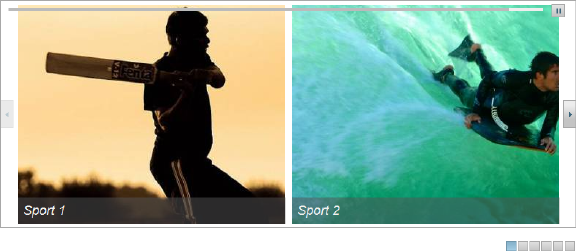
A pager is displayed below the control and a timer above which changes as images are autoplayed. A pager is displayed in the form of small buttons below the control. The control also does not loop through images.
In this step you customized the appearance and behavior of the controls. Congratulations, you've completed this quick start guide!