Like the C1RadialGauge control, C1LinearGauge includes a C1Gauge.Face element. The C1Gauge.Face appears above the background but behind the pointer and other elements. For example, the C1Gauge.Face is shown in the following image.
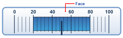
In the image above, the C1Gauge.Face element is customized:
To write code in Source View
<!— Face -->
<Face>
    <FaceStyle Stroke="#7BA0CC" StrokeWidth="4">
        <Fill LinearGradientAngle="270" ColorBegin="#FFFFFF" ColorEnd="#D9E3F0" Type="LinearGradient"></Fill>
    </FaceStyle>
</Face>
The C1Gauge.Face element appears by default as a blue-gray circle, but you can customize the appearance of the C1Gauge.Face element by setting several properties in the GaugeFace class, including the GaugeFace.FaceStyle property.