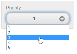
This is the default setting for the C1ListViewControlGroupItem. A C1ListViewControlGroupItem set to 'normal select' will allow users to select items from a drop-down list, as in the following image:
The markup used to create a normal select item resembles the following:
<cc1:C1ListViewControlGroupItem LabelText="Priority">
   <innerlistcontrols rows="5">
      <asp:ListItem>1</asp:ListItem>
      <asp:ListItem>2</asp:ListItem>
      <asp:ListItem>3</asp:ListItem>
      <asp:ListItem>4</asp:ListItem>
      <asp:ListItem>5</asp:ListItem>
   </innerlistcontrols>
</cc1:C1ListViewControlGroupItem>
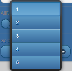
You can also create a select item with a drop-down menu that opens as an overlay with a pop transition as in the following image:
You can achieve this type of select item by setting the NativeMenu property to False:
  <cc1:C1ListViewControlGroupItem LabelText="Priority" NativeMenu="False">
       <innerlistcontrols rows="5">
             <asp:ListItem>1</asp:ListItem>
             <asp:ListItem>2</asp:ListItem>
             <asp:ListItem>3</asp:ListItem>
             <asp:ListItem>4</asp:ListItem>
             <asp:ListItem>5</asp:ListItem>
       </innerlistcontrols>
  </cc1:C1ListViewControlGroupItem>