A C1Pager control has six embedded themes that you can apply with just a few clicks. This topic illustrates how to change the theme in Design view, in Source view, and in code. For more information on themes, see C1Pager Themes.
In Design View
Complete the following steps:
 to open the C1Pager Tasks menu.
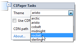
The rocket theme is applied to the C1Pager control.
In Source View
To change the theme of your C1Pager in Source view, add VisualStyle="rocket" to the <cc1:C1Pager> tag so that it resembles the following:
<cc1:C1Pager ID="C1Pager1" runat="server" Theme="rocket"/>
In Code View
Complete the following steps:
To write code in Visual Basic
| Visual Basic |
Copy Code
|
|---|---|
Imports C1.Web.Wijmo.Controls |
|
To write code in C#
| C# |
Copy Code
|
|---|---|
using C1.Web.Wijmo.Controls; |
|
Add the following code, which sets the Theme property, to the Page_Load event:
To write code in Visual Basic
| Visual Basic |
Copy Code
|
|---|---|
C1Pager1.Theme = "rocket" |
|
To write code in C#
| C# |
Copy Code
|
|---|---|
C1Pager1.Theme = "rocket"; |
|
Run the program.
 This topic illustrates the following:
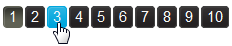
The following image shows a C1Pager control with the rocket theme: