In this step you'll customize the appearance of the C1RadialGauge control. The following steps assume you've completed Step 1 of 3: Adding C1RadialGauge to the Page topic and added a C1RadialGauge control to the page.
Complete the following steps to customize the C1RadialGauge control:
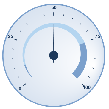
<cc1:C1RadialGauge ID="C1RadialGauge1" runat="server" Value="50" Max="100" StartAngle="-45" SweepAngle="270">This sets the Value and Max value of the control, as well as the gauge's StartAngle and SweepAngle.
<Animation Duration="2000" Easing="EaseOutBack"></Animation>
        <Labels Offset="30"></Labels>
        <TickMajor Position="Inside" Factor="2" Visible="True" Offset="27" Interval="25"></TickMajor>
        <TickMinor Position="Inside" Visible="True" Offset="30" Interval="5"></TickMinor>
        <Pointer Length="0.8" Width="4" Offset="0.15"></Pointer>
<Ranges>
         <cc1:GaugelRange EndDistance="0.58" EndValue="10" EndWidth="5" StartDistance="0.6" StartValue="0" StartWidth="2">
          <RangeStyle Stroke="#7BA0CC" StrokeWidth="0">
           <Fill Color="#7BA0CC"></Fill>
          </RangeStyle>
         </cc1:GaugelRange>
         <cc1:GaugelRange EndDistance="0.54" EndValue="75" EndWidth="20" StartDistance="0.58" StartValue="10" StartWidth="5">
          <RangeStyle Stroke="White" StrokeWidth="0">
           <Fill ColorBegin="#B4D5F0" ColorEnd="#B4D5F0" Type="LinearGradient"></Fill>
          </RangeStyle>
         </cc1:GaugelRange>
         <cc1:GaugelRange EndDistance="0.5" EndValue="100" EndWidth="25" StartDistance="0.54" StartValue="175" StartWidth="20">
          <RangeStyle Stroke="#7BA0CC" StrokeWidth="0">
           <Fill Color="#7BA0CC"></Fill>
          </RangeStyle>
         </cc1:GaugelRange>
        </Ranges>
Note that you set styles for the following items:
Notice the style changes that you made are reflected in the control.
In this step you customized the appearance of the C1RadialGauge control. In the next step you'll customize the behavior of the control.