The C1Splitter container control consists of two basic objects: a SplitterPanel, and an expander button. The SplitterPanel object defines the appearance and behavior for Panel1 and Panel2.
The following image labels the elements of the splitter on a default vertical C1Splitter control:
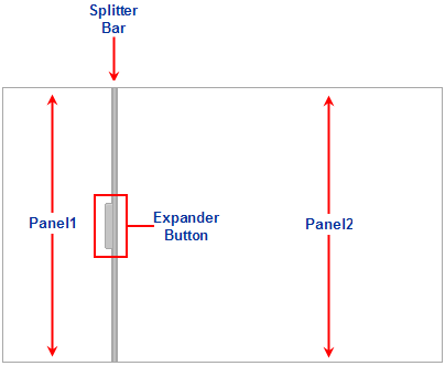
Splitter Panels
C1Splitter consists of two panels separated by a splitter bar. The panels appear to the left and right of the splitter bar for vertical splits and top and bottom for horizontal splits. C1Splitter refers to the left/top panel in the designer as Panel1 and the right/bottom panel as Panel2. In the designer, you can control each panel's appearance and behavior through Panel1 and Panel2 properties. Both panels contain the same properties from the SplitterPanel object. You can apply different behaviors and styles to each panel since you can set each panel individually.
To achieve these customizations, you can use any of the properties in the SplitterPanel object:
| Property | Description |
| SplitterPanel.Collapsed | Gets or sets a value determining whether the panel is collapsed or expanded. |
| SplitterPanel.MinSize | Gets or sets the minimum size of a splitter panel. |
| SplitterPanel.ScrollBars | Gets or sets the type of scroll bars to display for splitter panel. There are four options: None, Horizontal, Vertical, Both, and Auto. |
In the object model, both panels are referred as SplitterPanel. The SplitterPanel object contains properties and methods for Panel1 and Panel2.