A C1Splitter control has six embedded themes that you can apply with just a few clicks. This topic illustrates how to change the theme in Design view, in Source view, and in code. For more information on themes, see Themes.
Changing the Theme in Design View
Complete the following steps:
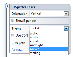
The rocket theme is applied to the C1Splitter control.
Changing the Theme in Source View
To change the theme of your C1Splitter in Source view, add Theme="rocket" to the <cc1:C1Splitter> tag so that it resembles the following:
<cc1:C1Splitter ID="C1Splitter1" runat="server" Theme="rocket">
Changing the Theme in Code
Complete the following steps:
To write the code in Visual Basic:
| Visual Basic |
Copy Code
|
|---|---|
| Imports C1.Web.Wijmo.Controls | |
To write the code in C#:
| C# |
Copy Code
|
|---|---|
| using C1.Web.Wijmo.Controls; | |
To write the code in Visual Basic:
| Visual Basic |
Copy Code
|
|---|---|
| C1Splitter1.Theme = "rocket" | |
To write the code in C#:
| C# |
Copy Code
|
|---|---|
| C1Splitter1.Theme = "rocket"; | |
This topic illustrates the following:
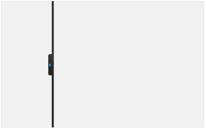
The following image shows a C1Splitter control with the rocket theme: