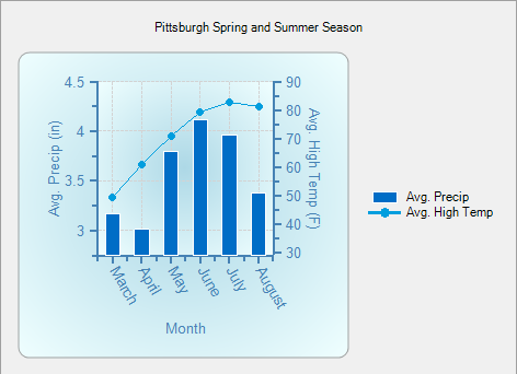
This section provides step-by-step instructions for programatically adding a Bar and XYPlot chart on the C1Chart control. The graph shows the Bar chart with a y-axis that represents the double values for the average precipitation and the x-axis that represents string values for each month from March till August. The XYPlot chart has a y2-axis that represents the double values for the average high temperature for each month from March till August and the x-axis that represents string values for each month from March till August.
The following chart illustration is shown before you begin creating the chart:
Multiple charts can be created programmatically using the following steps:
To write code in Visual Basic
| Visual Basic |
Copy Code
|
|---|---|
Imports C1.Win.C1Chart |
|
To write code in C#
| C# |
Copy Code
|
|---|---|
using C1.Win.C1Chart; |
|
To write code in Visual Basic
| Visual Basic |
Copy Code
|
|---|---|
Private Sub Form1_Load(sender As Object, e As EventArgs)
    Dim cgroup As ChartGroup = c1Chart1.ChartGroups.Group0
    cgroup.ChartType = Chart2DTypeEnum.Bar
    'input the data through the series collection
    Dim cdsc As ChartDataSeriesCollection = cgroup.ChartData.SeriesList
    cdsc.Clear()

    'remove default data
    'create the series object from the collection and add data
    Dim cds As ChartDataSeries = cdsc.AddNewSeries()
    ' Add Data for ChartGroup0, Bar chart
    Dim MonthNames As String() = {"March", "April", "May", "June", "July", "August"}
    Dim AvgPrecip As Double() = {3.17, 3.01, 3.8, 4.12, 3.96, 3.38}

    'create a label for the Bar chart data series
    cds.Label = "Avg. Precip"
    'Use the CopyDataIn method of the ChartDataArray object to copy the X and Y value data into the data series
    cds.X.CopyDataIn(MonthNames)
    cds.Y.CopyDataIn(AvgPrecip)
    'create variable for chart area

    Dim carea As C1.Win.C1Chart.Area = c1Chart1.ChartArea
    'Set axes titles for the ChartGroup0 (Bar)
    carea.AxisX.Text = "Month"
    carea.AxisY.Text = "Avg. Precip (in)"
    'create and add the data for the XY chart in Group1
    Dim cgroup2 As ChartGroup = c1Chart1.ChartGroups.Group1
    cgroup2.ChartType = Chart2DTypeEnum.XYPlot
    'input the bar chart data of group1 through the series collection
    Dim cdsc2 As ChartDataSeriesCollection = cgroup2.ChartData.SeriesList
    'create the series object from the second collection and add data
    Dim cds2 As ChartDataSeries = cdsc2.AddNewSeries()
    cds2.X.CopyDataIn(MonthNames)
    cds2.Y.CopyDataIn(New Double() {49.5, 60.7, 70.8, 79.1, 82.7, 81.1})
    cds2.Label = "Avg. High Temp"

    'customize axes
    'create new font for the X, Y and Y2 axes
    Dim f As New Font("Arial", 10)
    carea.AxisX.Font = f
    carea.AxisY.Font = f
    carea.AxisX.ForeColor = Color.SteelBlue
    carea.AxisY.ForeColor = Color.SteelBlue
    carea.AxisY2.ForeColor = Color.SteelBlue
    carea.AxisY2.Font = f

    'Set axes titles for the ChartGroup1 (XYPlot)
    carea.AxisY2.Text = "Avg. High Temp (F)"
    'set axis bounds
    carea.AxisY.Min = 2.75
    carea.AxisY2.Min = 30
    carea.AxisY2.Max = 90
    carea.AxisY.UnitMinor = 0.25

    'rotate the axis X annotation
    carea.AxisX.AnnotationRotation = 60

    'add legend
    c1Chart1.Legend.Visible = True

    'add header
    c1Chart1.Header.Visible = True
    c1Chart1.Header.Text = "Pittsburgh Spring and Summer Season"

    'add visual effects
    Dim s As Style = carea.Style
    s.ForeColor = Color.White
    s.BackColor = Color.LightBlue
    s.BackColor2 = Color.Azure
    s.GradientStyle = GradientStyleEnum.Radial
    c1Chart1.ColorGeneration = ColorGeneration.Flow
End Sub
|
|
To write code in C#
| C# |
Copy Code
|
|---|---|
private void Form1_Load(object sender, EventArgs e)
{
        ChartGroup cgroup = c1Chart1.ChartGroups.Group0;
        cgroup.ChartType = Chart2DTypeEnum.Bar;
        //input the data through the series collection
        ChartDataSeriesCollection cdsc = cgroup.ChartData.SeriesList;
        cdsc.Clear();

        //remove default data
        //create the series object from the collection and add data
        ChartDataSeries cds = cdsc.AddNewSeries();
        // Add Data for ChartGroup0, Bar chart
        string[] MonthNames = { "March", "April", "May", "June", "July", "August" };
        double[] AvgPrecip = { 3.17, 3.01, 3.80, 4.12, 3.96, 3.38};
        //create a label for the Bar chart data series
        cds.Label = "Avg. Precip";
        //Use the CopyDataIn method of the ChartDataArray object to copy the X and Y value data into the data series
        cds.X.CopyDataIn(MonthNames);
        cds.Y.CopyDataIn(AvgPrecip);

        //create variable for chart area
        C1.Win.C1Chart.Area carea = c1Chart1.ChartArea;
        //Set axes titles for the ChartGroup0 (Bar)
        carea.AxisX.Text = "Month";
        carea.AxisY.Text = "Avg. Precip (in)";
        //create and add the data for the XY chart in Group1
        ChartGroup cgroup2 = c1Chart1.ChartGroups.Group1;
        cgroup2.ChartType = Chart2DTypeEnum.XYPlot;
        //input the bar chart data of group1 through the series collection
        ChartDataSeriesCollection cdsc2 = cgroup2.ChartData.SeriesList;
        //create the series object from the second collection and add data
        ChartDataSeries cds2 = cdsc2.AddNewSeries();
        cds2.X.CopyDataIn(MonthNames);
        cds2.Y.CopyDataIn(new double[] { 49.5, 60.7, 70.8, 79.1, 82.7, 81.1});
        cds2.Label = "Avg. High Temp";

        //customize axes
        //create new font for the X, Y and Y2 axes
        Font f = new Font("Arial", 10);
        carea.AxisX.Font = f;
        carea.AxisY.Font = f;
        carea.AxisX.ForeColor = Color.SteelBlue;
        carea.AxisY.ForeColor = Color.SteelBlue;
        carea.AxisY2.ForeColor = Color.SteelBlue;
        carea.AxisY2.Font = f;
        //Set axes titles for the ChartGroup1 (XYPlot)
        carea.AxisY2.Text = "Avg. High Temp (F)";
        //set axis bounds
        carea.AxisY.Min = 2.75;
        carea.AxisY2.Min = 30;
        carea.AxisY2.Max = 90;
        carea.AxisY.UnitMinor = .25;

        //rotate the axis X annotation
        carea.AxisX.AnnotationRotation = 60;
        //add legend
        c1Chart1.Legend.Visible = true;

        //add header
        c1Chart1.Header.Visible = true;
        c1Chart1.Header.Text = "Pittsburgh Spring and Summer Season";

        //add visual Effects
        Style s = carea.Style;
        s.ForeColor = Color.White;
        s.BackColor = Color.LightBlue;
        s.BackColor2 = Color.Azure;
        s.GradientStyle = GradientStyleEnum.Radial;
        c1Chart1.ColorGeneration = ColorGeneration.Flow;
}
|
|