Step 4 of 4: Customize your Chart
In This Topic
In this section you'll learn how to make your chart more visually appealing and professional looking by using the built-in formatting effects.
After finishing this tutorial your data bound chart will appear like the following: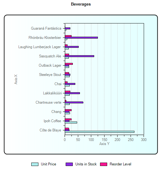
C1Chart formats the chart's back color as a control color and the plot area as a white color, but you can choose another color, use no color at all, or be creative and use two colors to create gradient effects.
Change the color for the data series
- Right-click the C1Chart control and select Chart Properties.
- In the Chart Properties designer, select Data.
- In the ChartData tab, select each series from the Data Series group box and click on the Fill drop-down checkbox to choose a specific fill color.
- Select Simple for the fill type and set the colors for the Unit Price to PaleTurquoise, the Units in Stock to BlueViolet, and the Reorder Level to DeepPink.
- Click OK.
Notice how the contrast between the light and dark colors in the series makes it easier to see the difference between the data series.
To make more room for the data in the chart we can adjust the position of the chart legend.
Modify the legend position
- Right-click the C1Chart control and select Chart Properties.
- In the Chart Properties designer, select Appearance>Legend.
- Click on the Position drop-down checkbox and select South.
- Click OK.
This helps free up horizontal space so the chart looks more appealing and easily readable.
To make the chart look less cluttered we can remove the horizontal gridlines since we only need the vertical gridlines to help us read the data.
Remove the horizontal gridlines
- Right-click the C1Chart control and select Chart Properties.
- In the Chart Properties designer, select AxisX>Gridlines.
- In the Major grid group, uncheck Visible.
The AxisX gridlines are removed from the chart.
- Click OK.
To make the text stand out more in the chart you can change the chart's font style and color.
Change the chart header's font style
- Right-click the C1Chart control and select Chart Properties.
- In the Chart Properties designer, select Appearance>Header.
- Click on the ForeColor drop-down listbox and select Black.
- Click on the Font button to open the Font dialog box. Change the font to Arial, its style to Bold, and its size to 10.
- Click OK.
Next, we should change the chart's border color from control to black to make it consistent with the chart's text color.
Change the chart's border color
- Right-click the C1Chart control and select Chart Properties.
- In the Chart Properties designer, select Appearance>ChartArea.
- In the Appearance [ChartArea] tab, click the Border drop-down checkbox and select Solid for the style, Black for the color, and 2 for the thickness.
- In the Appearance [PlotArea] tab, check Boxed.
- Click OK.
To add some style to the chart, we can add some gradient fill effects to the entire chart.
Add gradient fill effects to the chart
- Right-click the C1Chart control and select Chart Properties.
- In the Chart Properties designer, select Appearance>ChartArea.
- In the Appearance [ChartArea] tab, click the Fill drop-down checkbox and select the Gradient option. Several gradient options appear in the groupbox. Select the first gradient and choose White for Color1 and LightCyan for Color2, and then click OK.
Run the application and observe the chart's new appearance.
Congratulations, you have completed the C1Chart quick start! In this quick start you have learned how to:
- Bind C1Chart statically to a data table.
- Customize C1Chart's properties using the Chart Properties designer.
See Also