Bar and pie charts use a single value to represent each data point (price, units in stock, or reorder level). XYPlot charts, by contrast, use two values to represent each data point. They are useful to depict relationships between two dimensions of the data, and are often used in statistical analysis of data.
For example, the following chart illustrates an XY-Plot depicting the relationship between product unit prices and sales.
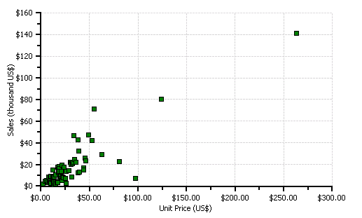
This type of chart is often used to support statistical techniques that quantify the relationship between the variables (typically Linear Regression Analysis). For example, the preceding chart illustrates a point with unit price above $250 that is relatively distant from the others. In a linear regression, this point would be called an "outlier", and would have a much greater influence on the result of the analysis than the other points in the series.
XY-Plot charts are also useful on their own, to show qualitative aspects of relationships. For example, are sales related to unit prices? In this example, the data seems to suggest there is indeed a relationship. Perhaps the customers prefer to buy expensive products from NorthWind and cheaper products from their local supermarkets.
The following code is used to create the chart in the preceding graphic. It is very similar to the code used to create the bar chart, except it sets the X and Y values to data, instead of using a simple sequence for the X values.
To write code in Visual Basic
| Visual Basic |
Copy Code
|
|---|---|
' get chart data
Dim data As DataView = _dataSet.Tables("Sales").DefaultView
data.Sort = "UnitPrice"

' configure chart
C1Chart1.Reset()
C1Chart1.ChartGroups(0).ChartType = Chart2DTypeEnum.XYPlot

' create single series for product price vs sales
Dim dscoll As ChartDataSeriesCollection = _
C1Chart1.ChartGroups(0).ChartData.SeriesList;
dscoll.Clear();

Dim series As ChartDataSeries = dscoll.AddNewSeries()

' show symbols only (no lines)
series.SymbolStyle.Color = Color.Green
series.SymbolStyle.OutlineColor = Color.Black
series.LineStyle.Pattern = LinePatternEnum.None

' populate the series
series.PointData.Length = data.Count
Dim i As Integer
For i = 0 To data.Count – 1
        series.X(i) = data(i)("UnitPrice")
        series.Y(i) = data(i)("ProductSales")
Next I

' attach product names to x-axis
Dim ax As Axis = C1Chart1.ChartArea.AxisX
ax.Text = "Unit Price (US$)"
ax.AnnoFormat = FormatEnum.NumericCurrency
ax.GridMajor.Visible = True

' configure y-axis
Dim ay As Axis = C1Chart1.ChartArea.AxisY
ay.Text = "Sales (thousand US$)"
ay.AnnoFormat = FormatEnum.NumericManual
ay.AnnoFormatString = "$#,##0,"
ay.GridMajor.Visible = True
|
|
To write code in C#
| C# |
Copy Code
|
|---|---|
// get chart data
DataView data = _dataSet.Tables["Sales"].DefaultView;
data.Sort = "UnitPrice";

// configure chart
c1Chart1.Reset();
c1Chart1.ChartGroups[0].ChartType = Chart2DTypeEnum.XYPlot;

// create single series for product price vs sales
ChartDataSeriesCollection
dscoll = c1Chart1.ChartGroups[0].ChartData.SeriesList;
dscoll.Clear();
ChartDataSeries series = dscoll.AddNewSeries();

// show symbols only (no lines)
series.SymbolStyle.Color = Color.Green;
series.SymbolStyle.OutlineColor = Color.Black;
series.LineStyle.Pattern = LinePatternEnum.None;

// populate the series
series.PointData.Length = data.Count;
for (int i = 0; i < data.Count; i++)
{
        series.X[i] = data[i]["UnitPrice"];
        series.Y[i] = data[i]["ProductSales"];
}

// attach product names to x-axis
Axis ax = c1Chart1.ChartArea.AxisX;
ax.Text = "Unit Price (US$)";
ax.AnnoFormat = FormatEnum.NumericCurrency;
ax.GridMajor.Visible = true;

// configure y-axis
Axis ay = c1Chart1.ChartArea.AxisY;
ay.Text = "Sales (thousand US$)";
ay.AnnoFormat = FormatEnum.NumericManual;
ay.AnnoFormatString = "$#,##0,";
ay.GridMajor.Visible = true;
|
|