The C1Ribbon containers can hold the following Ribbon items:
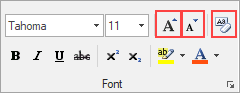
The RibbonButton items in this Font group are highlighted below:
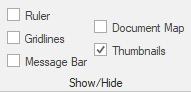
The check box control allows the user to validate or invalidate an option. The following Show/Hide group contains numerous RibbonCheckBox elements:
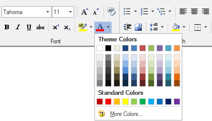
A color picker is a button that shows a drop-down color palette. Use the RibbonColorPicker to select a specific color from a preset palette. Click the color picker's drop-down arrow to reveal the color palette, which contains theme colors, standard colors, and more:
A combo box is a combination of a drop-down list or list box and a single-line text box. The RibbonComboBox item in this Font group is highlighted below:
The RibbonControlHost element allows the user to host an arbitrary control in a RibbonGroup. For more information on using the RibbonControlHost, please see the Embedding Controls in a Ribbon topic.
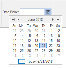
A date picker control allows a user to enter a specific date in the numeric box or to choose a specific date from a drop-down calendar. Click the DatePicker's drop-down arrow to choose a date from the calendar:
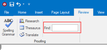
Represents a text box control. The RibbonTextBox element in this Proofing group is highlighted below:
A gallery consists of gallery groups. The RibbonGallery is designed to allow the user to select items visually in a grid or menu-like layout. This results-oriented approach allows users to quickly see the features and make a selection from a group of items. A gallery may be displayed in either collapsed or expanded view.
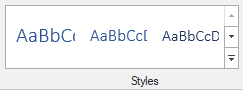
For example, a user can view a gallery with different styles, preview the results, and choose a design without having to navigate through a number of menus and dialog boxes:
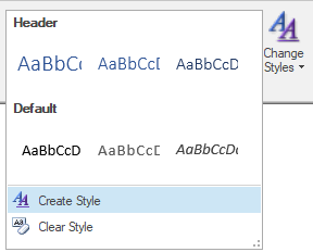
You can also choose to create a style using the Styles dropdown:
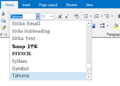
A RibbonFontComboBox is a combination of a drop-down list or list box that shows available font styles and a single-line text box. Click the font combo box to reveal the list of available font styles:
The RibbonLabel elements in this Clipboard group are highlighted below:
This is a button that shows a drop-down menu. Use a menu button when you need a menu for a small set of related commands. The following Styles group contains a RibbonMenu item:

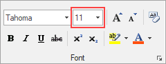
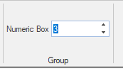
The numeric box allows the user to to select a number by using the increment and decrement buttons or by entering a number is the numeric box:
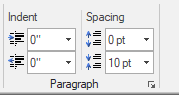
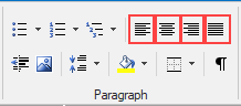
The separator item can be used in a Ribbon group, toolbar, or drop-down element to visually separate groups of Ribbon items. The RibbonSeparator items in this Paragraph group are highlighted below:
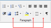
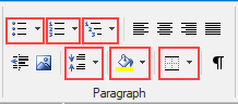
A split button combines a regular button and a drop-down list. Use a split button to combine a set of variations of a command, especially when one of the commands is used often. The RibbonSplitButton elements in this Paragraph group are highlighted below:
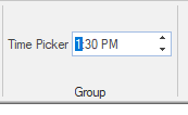
The time picker control allows the user to enter a specific time in the numeric box or to choose a specific time using the increment and decrement buttons.
A toggle button displays like a command button, but works like a check box. This element can be grouped using the ToggleGroupName property. The RibbonToggleButton elements in this Paragraph group are highlighted below:
The application menu tab allows user to display a hosted control on the right side of the menu. This item is only available in the application menu for the WholeForm appearance.