DockingTab provides various options of tab and text layout. Let's explore setting tab layout and text layout in detail in the sub-sections.
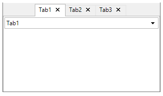
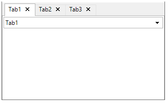
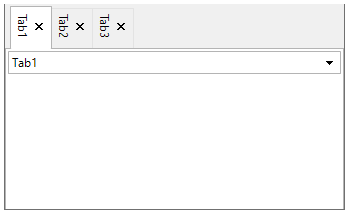
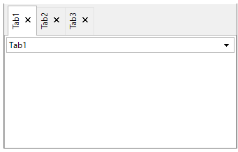
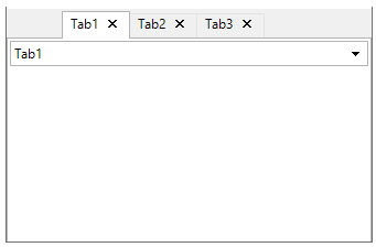
DockingTab provides various options for the tab orientation. The tabs can be aligned to the top, bottom, left, or right of the DockingTab control by using the Alignment property.
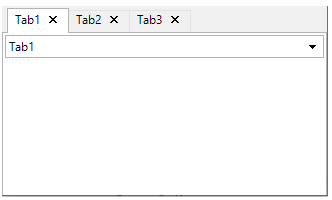
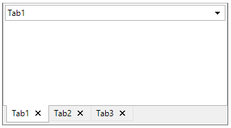
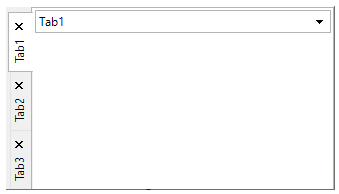
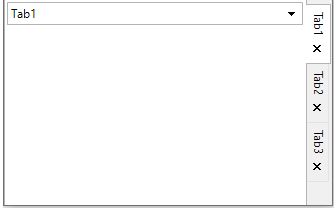
The table below enlists the four types of alignment of tabs on the Docking Tab:
| Alignment | Snapshot | Description |
| Top |
|
Aligns tab to the top of DockingTab. |
| Bottom |
|
Aligns tab to the bottom of DockingTab. |
| Left |
|
Aligns tab to the left of DockingTab. |
| Right |
|
Aligns tab to the right of DockingTab. |
The code snippet below shows how to align tabs towards the top region on the tab control.
| C# |
Copy Code
|
|---|---|
// Specify location of tabs in tab control
dockingTab.Alignment = TabAlignment.Top;
|
|
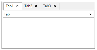
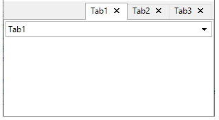
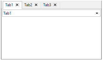
DockingTab also provides property to specify how to align the tabs along the side of the page content area by setting the AlignTabs property to Near, Far, or Center.
The table below enlist the four types of alignment of tabs on tab page:
| Alignment | Snapshot | Description |
| Near |
|
Aligns tabs near the side of the page content area. |
| Far |
|
Aligns tabs far from the side of the page content area. |
| Center |
|
Aligns tabs towards the center of the page content area. |
The code snippet below shows how to align tabs towards the center of the tab page.
| C# |
Copy Code
|
|---|---|
// Align tabs along the side of page content area
dockingTab.AlignTabs = StringAlignment.Center;
|
|
DockingTab also provides the functionality of indentation for the initial tab from the side of DockingTab control. For this purpose, C1DockingTab class uses the Indent property.
The code snippet shows how to set indentation for tabs in pixels for the DockingTab control.
| C# |
Copy Code
|
|---|---|
// Sets the indentation of the first tab from the side of the control
dockingTab.Indent = 30;
|
|
In addition to determining the layout of the tabs, you can also customize the layout or orientation of the text in the tabs. You can use the TextDirection property to display the text horizontally, vertically from right to left, or vertically from left to right.
A text can be added to each tab page using the Text property in the Properties window for C1DockingTabPage or using the C1DockingTabPage Collection Editor
The following table illustrates how the tabs appear when the TextDirection is set to Horizontal, VerticalLeft, or VerticalRight.
| Text Direction | Snapshot | Description |
| Default |
|
Default direction: horizontal for top and bottom docked tabs and VerticalLeft and VerticalRight for left and right docked tabs. |
| Horizontal |
|
Text is drawn horizontally on the tab. |
| VerticalRight |
|
Text is aligned vertically on the tab, but clockwise. |
| VerticalRight |
|
Text is aligned vertically on the tab, but anti-clockwise. |
The code snippet below shows how to align text 'VerticalRight' on a tab button.
| C# |
Copy Code
|
|---|---|
// Set direction for the text drawn on the tab
dockingTab.TextDirection = TabTextDirectionEnum.VerticalRight;
|
|
DockingTab lets you display both the text and an image in a tab. Moreover, you can set the text above, below, to the left or to the right of the image. For this, the TabLayout property in C1DockingTab class can be set in the Properties window or via code.
You can add an image to each tab page using the Image property in the Properties window for C1DockingTabPage or using the C1DockingTabPage Collection Editor.
The table below lists the types of Tab Layout options for tab buttons:
| Tab Layout | Snapshot | Description |
| Text Above | 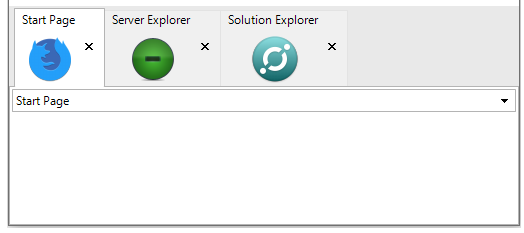 |
Text appears above the image on tabs. |
| Text Below | 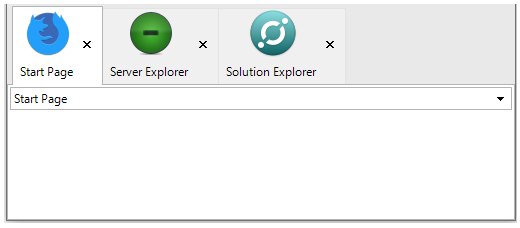 |
Text appears below the image on tabs. |
| Text Left | 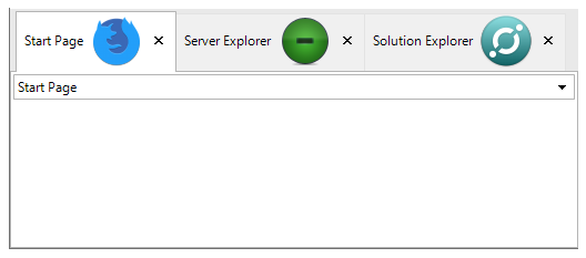 |
Text appears on the left of the image on tabs. |
| Text Right | 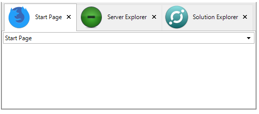 |
Text appears towards the right of the image on tabs. |
The code snippet below shows how to assign the relative position of text and image on a tab button:
| C# |
Copy Code
|
|---|---|
// Specifies relative location of text and image on the tab button
dockingTab.TabLayout = ButtonLayoutEnum.TextAbove;
|
|