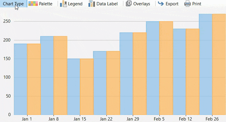
Financial Chart Toolbar provides you access to some basic chart operations at runtime. It lets you change chart type/color palette, alter current legends/data label settings, export, print charts, and do much more. The toolbar helps you to customize the chart appearance as shown in the following GIF.
In FinancialChart, the FinancialChart toolbar is represented by the FinancialChartToolbar class provided by C1.Win.Chart.Finance.Toolbar namespace of the C1.Win.FinancialChart.Toolbar assembly.
By default, the toolbar at runtime comprises the following menu buttons. Each button when clicked provides a dropdown of items. The following table provides a brief overview about the different commands on the FinancialChart Toolbar.
| Toolbar Commands | Description |
|---|---|
| ChartType | Provides different chart and stacking types. |
| Palette | Displays different color options to render the chart. |
| Legend | Provides different legend position options. |
| DataLabel | Provides different data label position options. |
| Overlays | Provides different overlays options. |
| Export | Provides different export options. |
| Prints the chart. |
To access the FinancialChart toolbar, right-click the FinancialChart control and select Add/Remove Toolbar option from the context menu. The Financial Chart Toolbar appears as follows:
The FinancialChart toolbar appear as follows:

You can click the FinancialChartToolbar's smart tag to open the FinancialChartToolbar Tasks smart tag panel which is shown in the following image.
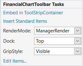
The table below lists the different options available in the smart tag:
| Smart tag options | Description |
|---|---|
| Embed in ToolStripContainer | Allows you to add tool items into a toolstrip container. |
| Insert Standard Items | Allows you to insert standard menu items like New, Open, Save, Cut, Copy, Paste, Help etc. |
| RenderMode | Indicates the visual styles to be applied to the ToolStrip. The default value is ManagerRenderMode. |
| Dock | Allows you to dock the control on the form. |
| GripStyle | Specifies the style of the sizing grip. |
| Edit Items | Opens the Items Collection Editor. |
FinancialChart provides access to many basic operations via toolbar. However, there might be a scenario where you would want to add more UI items to the toolbar to extend the basic functionalities. This section discusses how to add UI items to the toolbar at design time or through code.
You can use Items Collection Editor to add UI items to toolbar at design time. To access this editor, click on Insert Standard Items option from the smart tag panel.
The Items Collection Editor appears as following:
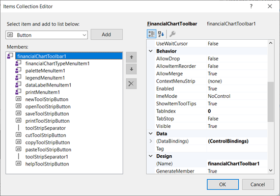
In the Items Collection Editor window, the left pane displays a list of menu items. The right pane displays properties for each menu item along with the OK and Cancel buttons.
Besides Items Collection Editor, you can use Insert Standard Items option from the smart tag panel to add more items to the toolbar. Clicking this option adds some standard menu items such as Open, Copy, Paste, New, and so on as shown in the following image:

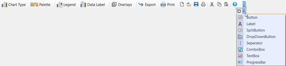
You can also add new items such as buttons, split buttons, separators, dropdown, combo boxes, etc. to the FinancialChart toolbar using Add More Items button ( ), which appears at the right-most corner of the toolbar at design time. This button opens a dropdown of items that can be added to the toolbar as shown in the following image.
You can add UI items to the toolbar using Add method of the ToolStripItemCollection class. Moreover, you can use the AddRange method to add a series of items to the toolbar. The following GIF showcases zigzag overlay item added to the FinancialChart Toolbar UI.

The following code adds a zigzag overlay to the toolbar using the Add method.
| C# |
Copy Code
|
|---|---|
//ZigZagMenuItem var zigZagMenuItem = new ZigZagMenuItem(); toolbar.Items.Add(zigZagMenuItem); |
|
Similarly, you can add other financial overlays in the FinancialChart toolbar UI. Financial overlays, like technical indicators, are a set of derived data that is calculated by applying one or more formulas to the original set of data. Financial overlays are generally used to forecast an asset's market direction and generally plotted with the original data set since the Y-axis scales are the same. With these overlay indicators, you can plot various stock studies over the main stock price to analyze any portfolio adjustments and avoid inefficient transactions. By doing so, they can ensure that their strategies are implemented and coordinated effectively.
FinancialChart supports various financial overlays which are described in the table provided below. Each of these overlays have a dedicated class and properties. You can easily add these overlays in the FinancialChart Toolbar using the Add method in a similar way as we added the zigzag overlay in the code above.
| Financial Overlays | Class |
|---|---|
| Bollinger Bands | BollingerBandsMenuItem |
| Envelopes | EnvelopesMenuItem |
| Zig-Zag | ZigZagMenuItem |
| Alligator | AlligatorMenuItem |
| Moving Average | MovingAverageMenuItem |
For more details on different overlays, see Overlays.