In This Topic
FlexChart supports a wide range of chart types including various variations. For instance, along with line charts, you can also create stacked line chart, stacked 100 line chart etc. using properties available in the FlexChart API. This topic gives a quick snapshot of all the major chart types along with their use cases. The thumbnails below let you have a glance of how a particular chart type looks like. To know about variations of these chart types, you can navigate to corresponding topics by clicking on the hyperlinks.
Basic Charts
| Chart Type |
Chart Snapshot |
Use Case |
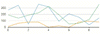
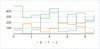
| Line Chart |
|
Use line charts to plot the continuously changing data against a periodic interval. They are generally used to show trends over a period of time. However, they can also be used to plot data against other continuous periodic values such as temperature, distance etc. |
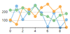
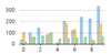
| Line Symbol Chart |
|
Use line symbol charts when you want to indicate the exact data points plotted on a line chart. |
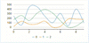
| Spline Chart |
|
Like line charts, use the spline charts to demonstrate the data changing against a periodic interval. However, unlike line chart, they show the gradual change in trend. They are also aesthetically better than a line chart. |
| Spline Symbol Chart |
|
Use spline symbol charts when you want to indicate the exact data points plotted on a spline chart. |
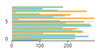
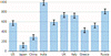
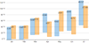
| Bar Chart |
|
Use bar charts for demonstrating patterns and trends across different categories. In these charts, each horizontal bar corresponds to a category and its length corresponds to the value or measure of that category. |
| Column Chart |
|
Very similar in usage with bar charts, column charts use vertical columns instead of horizontal bars for identifying the trends. These charts are generally used in the case of fewer categories that can be plotted easily on X-axis. |
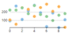
| Scatter Chart |
|
Use the scatter chart to graph the pairs of numerical data and hence to identify the relationship between the two variables. |
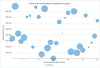
| Bubble Chart |
|
Use the bubble charts to plot three dimensional data. Bubble charts are often used to present financial data. |
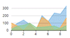
| Area Chart |
|
Use area charts to emphasize the magnitude of trend along with demonstrating the trend. Based on line charts, area charts are distinct because of the filled area between the line segments and the x-axis. |
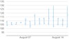
| Step Chart |
|
Use step charts to plot the data that shows sudden changes on irregular intervals and remains constant between these intervals. |
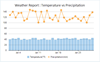
| Combination Chart |
|
Use the combination of two or more different charts in same plot area to compare the different data sets that are related to each other. |
| Pie Chart |
|
Use pie charts to demonstrate the relative contribution of various categories. |
| Donut/Doughnut Chart |
|
Similar to pie charts, use donut charts to display proportional data with just a visual difference of a hole in the center. |
Financial Charts
| Chart Type |
Chart Snapshot |
Use Case |
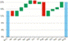
| Candlestick |
|
Use candlestick charts to plot high, low, open and close values of stock over a period of time. In these charts, area between open and close values forms body of a candle and, vertical lines between high and low values form the wick and tail respectively. |
| HighLowOpenClose (HLOC) |
|
Similar to candlestick charts, use HLOC charts to show the stock's high, low, open and close values. The only difference between the two is that there is no candlestick body in this case. |
Statistical Charts
| Chart Type |
Chart Snapshot |
Use Case |
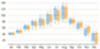
| Box-and-Whisker |
|
Use box-and-whisker charts to display the distribution of numerical data in the form of quartiles, means and outliers. |
| Error Bar |
|
Use error bar charts to indicate the estimated error in the measured data through standard deviation of the data set. |
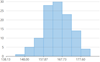
| Histogram |
|
Use histograms to present the data distribution over a continuous interval to know which sub-interval gets the maximum or minimum frequency. |
| Ranged Histogram |
|
Use Excel-like histogram to visualize the frequency distribution against ranged X-axis in category or non-category mode. |
| Pareto Chart |
|
Use pareto chart to analyze the frequency of problems or causes in a process. |
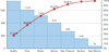
| Waterfall Chart |
|
Use waterfall charts to indicate the fluctuation in data over a period of time and its cumulative impact on an initial value. |
Specialized Charts
| Chart Type |
Chart Snapshot |
Use Case |
| Heat Map |
|
Use heat maps to identify the data variance with the help of color coding. |
| Floating Bar Chart |
|
Use floating bar charts when you have two Y-values (high and low) for each X-value. As the name suggests, these charts plot floating bars between these Y-values to indicate maximum and minimum readings. |
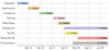
| Gantt Chart |
|
Use gantt charts to demonstrate the project schedules with project activities listed on Y-axis and time scale on X-axis. These charts present each activity as a horizontal bar starting at the start time of the activity with length equivalent to the duration of same. |
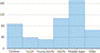
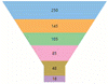
| Funnel Chart |
|
Use funnel chart to demonstrate the gradual reduction in data as it moves through various stages of a linear process. These charts also help in identifying the problem areas in such processes. |
| Radar Chart |
|
Use radar chart to visually compare multiple quantitative variables against various features where each variable is placed radially around a common center point. |
| Polar Chart |
|
Similar to radar charts, use the polar charts to compare multivariate data with a difference that in this case, X-values are numeric values specifying angles in degrees. |
| Sunburst Chart |
|
Use sunburst charts to present data with multiple hierarchy levels with the help of stacked slices arranged in multiple rings. |
| TreeMap |
|
Use treemaps to display the hierarchical data in the form of nested rectangles, hence saving a lot of screen estate, especially in the case of huge hierarchical data sets. |
See Also