FlexChart lets you configure the charts easily at design-time using the property window, collection editors, smart tags etc. in Visual Studio. There are a lot of options available through property window such as configuring chart axes, setting chart type, configuring data source, applying animation, customizing look and feel etc. Apart from the property window, FlexChart also provides following smart tag panels and collection editors to make your coding task easier:
Smart tags provide quick and easy access to common properties in the design time. The smart tag panel for charts can be accessed by the smart tag (  ) on the upper right corner of the control. It can also be accessed directly by clicking any specific element of the chart such as axis, legend, series, etc. The tables below describe smart tag panels available in various charts.
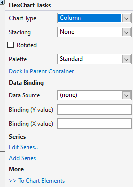
The FlexChart Tasks smart tag panel allows you to choose the Chart Type, select the Data Source, Add or Edit the series and so on. The following table shows options available in tasks panel of the FlexChart control.
|
|
Option | Description |
| Chart Type |
Choose from extensive collection of Chart Types from the dropdown list. By default it is Column. |
|
| Stacking |
Choose from the options available in the dropdown that allows to arrange the Series of the chart one above the other as a stack. |
|
| Rotated |
Select this option to transpose both the axes |
|
| Palette |
Choose from the color templates that are available from the dropdown list. |
|
| Dock In Parent Container |
Choose this option to automatically resize the FlexChart to the size of its Parent Container. |
|
| Data Source |
Choose the Data Source for presenting data on the FlexChart. |
|
| Binding (Y Value) |
Choose the name of the property that contains Y values for the series. |
|
| Binding (X Value) |
Choose the name of the property that contains X values for the series. |
|
| Edit Series |
Opens the Series Collection Editor. It can be used to add the chart series and set related properties. |
|
| Add Series |
Choose this option to add another series to existing FlexChart and set its properties. |
|
| To Chart Elements | Allows to access and set properties to chart elements, such as Axes, Labels, Legends, etc. | |
|
|
Option | Description |
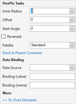
| Inner Radius |
Choose the values from the dropdown to create a hole in the center of the charts. By default, this property is set to zero. |
|
| Offset | Choose the values from the dropdown to push each slice of the chart away from the center. By default, this property is set to zero. | |
| Start Angle | Choose the value from dropdown to change the angle of the first slice . By default, this property is set to zero. | |
| Reversed |
Select this option to create the chart with angles drawn in the counter clockwise direction. |
|
| Palette |
Choose from the color templates that are available from the dropdown list. |
|
| Dock In Parent Container |
Choose this option to automatically resize the FlexChart to the size of its Parent Container. |
|
| Data Source |
Choose the Data Source for presenting data on the FlexChart. |
|
| Binding (value) |
Choose the value of the property to bind the Pie slices of the chart. |
|
| Binding (name) |
Choose the name of the property to bind the labels of Pie slices of the chart. |
|
| To Chart Elements | Allows to access and set properties to chart elements, such as Axes, Labels, Legends, etc. | |
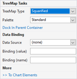
The TreeMap Tasks smart tag panel allows you to choose the TreeMap Type, color Palette, Data Source, and so on. The following table shows options available in smart tag panel for the TreeMap control.
|
|
Option | Description |
| TreeMap Type |
Choose the type of TreeMap chart from the dropdown list. By default, it is set as Squarified. |
|
| Palette | Choose from the color templates from the available list. By default, it is set as standard. | |
| Dock in Parent Container | Choose this option to automatically resize the TreeMap to the size of its parent Container. | |
| Data Source |
Choose the Data Source for presenting data on the TreeMap. |
|
| Binding (value) |
Choose the value of the property to bind the Pie slices of the chart. |
|
| Binding (name) |
Choose the name of the property to bind the labels of the chart. |
|
| To Chart Elements | Allows to access and set properties to chart elements, such as Labels, Legends, etc. | |
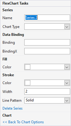
The Add Series Tasks smart tag panel is similar in both FlexChart and FlexRadar. It provides easy access to the commonly used properties of series. To access this smart tag panel, click on the series in the chart area or click on the Add Series option from the FlexChart or FlexRadar Tasks Smart Tag Panel.
|
|
Option | Description |
| Name | Set the name of the series. This series name also reflects on the Legend in the FlexChart. | |
| Chart Type | Choose from extensive collection of chart types from the dropdown list. | |
| Binding | Choose the name of the property that contains Y axis values for the series. | |
| BindingX | Choose the name of the property that contains X axis values for the series. | |
| Color (Fill) | Choose the Fill Color for the series. | |
| Color (Stroke) | Choose the color for the Line of the series | |
| Width | Choose the Width for the line of the series | |
| Line Pattern | Choose the pattern for the line of the series from the dropdown list. By default, it is set as Solid. | |
| Delete Series | Select this to delete the series from the FlexChart. | |
| Back To Chart Options | Select this option to go back to the FlexChart smart tag panel. | |
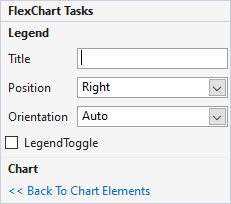
Legend related task panel can be accessed by clicking Legend on the FlexChart or by clicking “To Chart Elements” on the FlexChart Tasks smart tag panel and choosing the Legend option. The same list of options are available for FlexPie, Sunburst, FlexRadar, and TreeMap as well.
|
|
Option | Description |
| Title | Set the Title property for the Legend. | |
| Position | Set the Position of the Legend from the available options in the dropdown list. By default, it is Right. | |
| Orientation | Set the Orientation of the Legend from the available options in the dropdown list. By default, it is Auto. | |
| Legend Toggle | Toggle the visibility of the data series on FlexChart during runtime with this option. By default, the toggle option is disabled. | |
| Back To Chart Elements | Select this option to go back to the FlexChart smart tag panel. | |
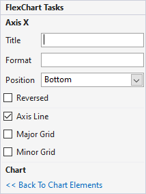
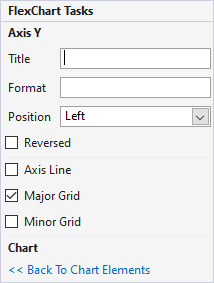
Axis related task panel is similar for both FlexChart and FlexRadar. It can be accessed by clicking “To Chart Elements” on the FlexChart and FlexRadar Tasks smart tag panel and accessing Axis options or by clicking Axis on the FlexChart and FlexRadar.
  |
Option | Description |
| Title | Set the title for the X or Y Axis of the FlexChart. | |
| Format | Set the format used by the Axes labels. | |
| Position | Choose from the options available in the dropdown list to set position of the Axis labels. | |
| Reversed | Select this checkbox to flip the display order of Axes Labels. | |
| Axis Line | Select this checkbox to either display or hide the Axes lines. | |
| Major/Minor Grid | Select this checkbox to either display or hide the Gridlines on the Chart area. | |
| Back To Chart Elements | Select this option to go back to the FlexChart smart tag panel. | |
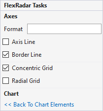 |
Option | Description |
| Format | Allows to set the format used by the Axes labels. | |
| Axis Line | Select this checkbox to either display or hide Axis line. | |
| Border Line | Select this checkbox to either display or hide border around the chart. | |
| Concentric Grid | Select this checkbox to either display or hide Concentric Grid lines on the chart. | |
| Radial Grid | Select this checkbox to either display or hide Radial Grid lines from the center to all the vertices of the chart. | |
| Back to Chart Elements | Select this option to go back to FlexRadar smart tag panel. |
You can add header or footer for the chart using Add Header/ Add Footer option. This option can be accessed by clicking "To Chart Elements" from the FlexChart Tasks smart tag panel. The same task panel is also available in FlexPie, Sunburst, FlexRadar, and TreeMap as well.
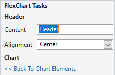 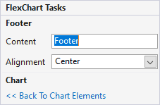 |
Option | Description |
| Content | Set the value for Header/Footer of the FlexChart. | |
| Alignment | Set the position of the Header or Footer from the options available in the dropdown list. | |
| Back To Chart Elements | Select this option to go back to the FlexChart smart tag panel. | |
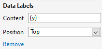
Data Labels can be added by using Add option under Data Labels. This option can be accessed by clicking "To Chart Elements" from the FlexChart Tasks smart tag panel. The same task panel is also available in FlexPie, Sunburst, FlexRadar, and TreeMap as well.
|
|
Option | Description |
| Content | Set the value to Data Labels. The value can be either X or Y that represent respective Axes and must be enclosed within { }. | |
| Position | Set the Position of the Data Label on the Series of the FlexChart from the available options in the dropdown list. | |
| Remove | Choose this option to remove the applied Data Labels from the FlexChart. | |
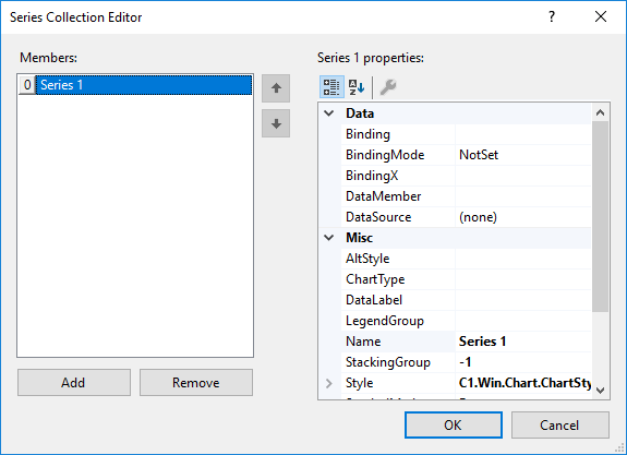
Series Collection Editor of FlexChart can be used to add the series and set the related properties at design-time. You can set the data source, chart type, tooltip, visibility etc. of each series using this collection editor. Following are the steps to access the same: