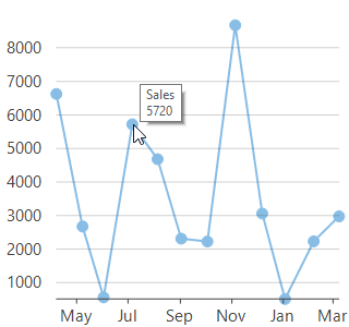
Tooltips in a chart are displayed when a user hovers over data points in the chart, thus making the chart more explanatory without creating any visual clutter. By default, FlexChart displays a tooltip showing the series name and value of the data point. However, you can also customize and format these tooltips easily to make them even more informative and clear.
|
Default tooltip |
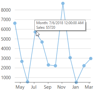
Custom tooltip |
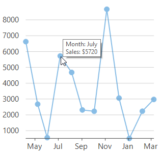
Formatted Tooltip |
|---|---|---|
 |
 |
 |
FlexChart allows you to customize the tooltip by assigning the template strings in the Content property. You can use the following predefined parameters to create a template string. For instance, you can display a tooltip with the x-value as well as y-value along with their series name.
| Parameter | Description |
|---|---|
| x | Refers to the X value of data point. |
| y | Refer to the Y value of data point. |
| value | Refers to the value of data point. |
| name | Refers to the name of data point. |
| seriesName | Refers to the name of series that contains the data point. |
| pointIndex | Refers to the index of data point. |
| propertyName | Refers to property of data object represented by the point. |
FlexChart allows you to format the data that is being displayed by specifying the formats in the template string itself which is assigned to the Content property. For instance, you can format the sales or expenses figures by using the required currency, separators or even number of decimal places. You can also use the various date formats, long and short, to display the values of time series.
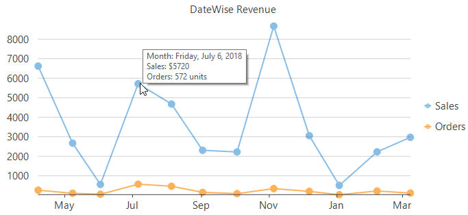
Shared tooltip, that is, a single tooltip for multiple series can be used to display the data values of all series against a particular x-value. FlexChart allows you to customize the Content property to display the data values of multiple series using the parameters discussed in the Custom Tooltip section.