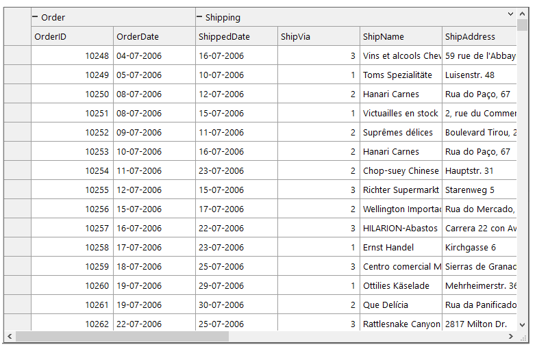
FlexGrid allows you to organize columns into logical groups, known as Column Bands, which can be used to create Banded grid view, where the data is represented in a tabular form with columns arranged into Bands. The Banded View makes it easier to represent huge amount of data in the grid. For example, suppose you want to display the order and shipping details of products in a grid. In this case, you can create a banded view to organize data in a hierarchical structure and manage it easily.
The Column Bands feature of the FlexGrid uses the C1FlexGridBandedView class of C1.Win.FlexGrid namespace of C1.Win.FlexGrid.BandedView assembly. Users can add the C1.Win.FlexGrid.BandedView NuGet package using the NuGet Package Manager. This will add the NuGet packages under the Dependencies section in the Solution Explorer. On switching to the Design View, you will find the FlexGridBandedView component in the ToolBox, which when added to the designer gets added in the ComponentTray.
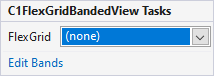
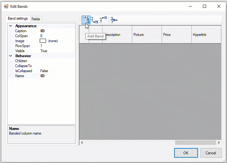
The right pane displays a toolbar of band operation buttons towards the top such as Add Band, Add child Band, Add parent Band and Remove Band.This section helps you configure banded view in FlexGrid control using C1FlexGridBandedView Tasks smart tag panel in .NET and .NET Framework.
Clicking the FlexGridBandedView smart tag icon ( ) opens the C1FlexGridBandedView Tasks smart tag panel as shown in the following image.
The C1FlexGridBandedView Tasks smart tag panel lets you bind the FlexGridBandedView with a FlexGrid control, and edit the band settings using the Edit Bands Editor. It also lets you create multi-level bands by adding multiple child bands to a parent band.
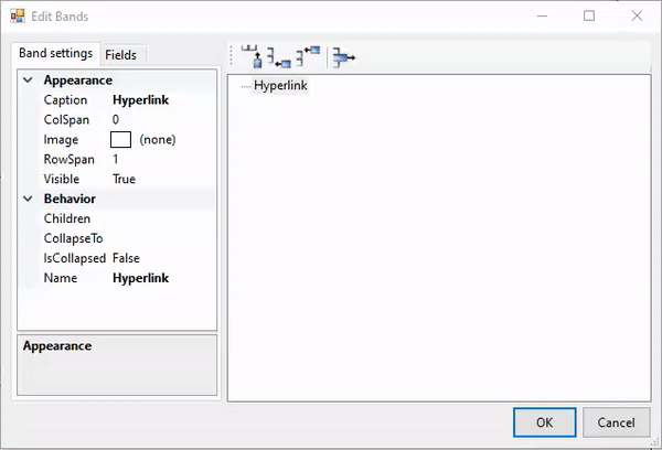
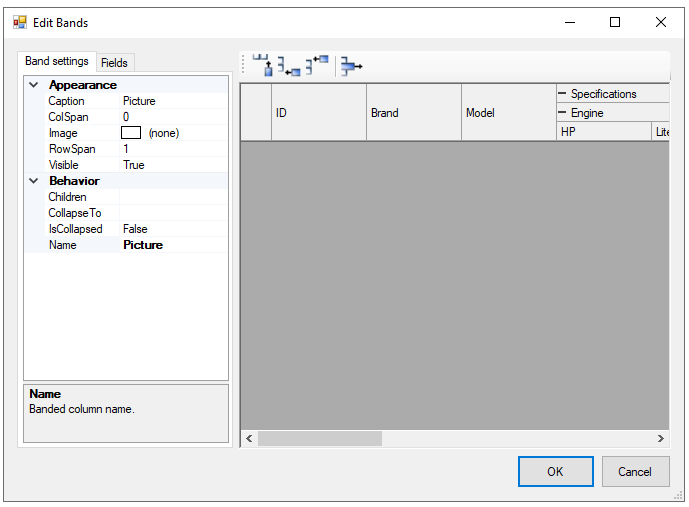
The Edit Bands Editor has two panes. The left pane provides two tabs, Band settings and Fields. The Band settings tab provides various properties for changing the settings of each band. The Fields tab allows the band names selection. The right pane displays a toolbar of band operation buttons such as Add Band, Add child Band, Add parent Band and Remove Band, towards the top. Just below the toolbar is the band fields where all changes post the addition, deletion or customization of bands are reflected in the band fields.
Clicking on the FlexGridBandedView smart tag, opens the FlexGridBandedView Tasks smart tag panel.
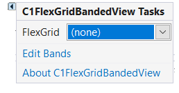
The Tasks smart tag panel lets you bind the FlexGridBandedView with a FlexGrid control, and edit the band settings and fields using the Edit Bands Editor.
The Edit Bands Editor has two panes. The left pane provides two tabs, Band settings and Fields. The Band settings tab provides various properties for changing the settings of each band. The Fields tab allows the band names selection. The right pane displays a toolbar of band operation buttons such as Add Band, Add child Band, Add parent Band and Remove Band, towards the top. Just below the toolbar is the band fields where all changes post the addition, deletion or customization of bands are reflected in the band fields.
Observe the GIF below to understand the working of the Bands Editor.
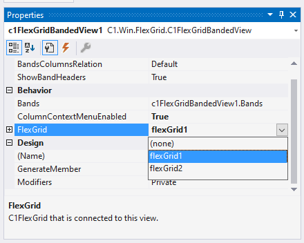
If you observe the properties of the FlexGridBandedView component in the Properties window, you will find the FlexGrid property, which allows you to assign a preferred FlexGrid control to the component.
You can also set the FlexGrid property in the code behind as given below:
| C# |
Copy Code
|
|---|---|
// Assign a FlexGrid control
c1FlexGridBandedView1.FlexGrid = flexGrid1;
|
|
The banded view is formed by arranging columns into bands wherein a collection of two or more individual columns are placed under a common header. In FlexGrid, the concept of Banded view is implemented using MergedRanges and FixedRows. You can create a Banded view by assigning columns to the respective Bands. This section contains information about banded columns and the operations that can be performed on them.
You can create bands by using the Bands property of C1FlexGridBandedView class and Add() method of BandCollection class. You can also use the AddRange( ) method of the BandCollection class to add a range of columns.
The below code snippet shows how you can add a column to the band.
| C# |
Copy Code
|
|---|---|
var bands = c1FlexGridBandedView1.Bands; var band1 = bands.Add("Order"); |
|
Header Band represents the header for logically grouped columns. You can assign any number of Banded columns to a Header Band. You can set the following properties of Header Band.
The code snippet below depicts the use of these properties:
| C# |
Copy Code
|
|---|---|
var bands = c1FlexGridBandedView1.Bands; var band1 = bands.Add("Order"); band1.Children.Add("OrderID"); band1.Children.Add("OrderDate"); band1.CollapseTo = "OrderDate"; band1.Caption = "Order1"; band1.RowSpan = 2; band1.ColSpan = 2; band1.Visible = true; |
|
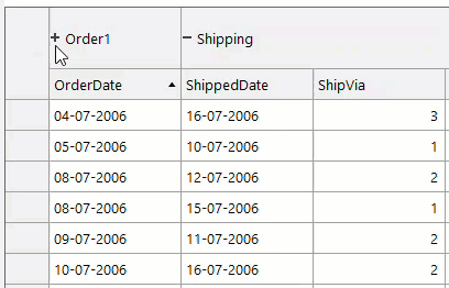
Further, at runtime, users can vertically collapse the header using the chevron button.
FlexGrid allows you to create multi-level bands by stacking multiple bands or by adding multiple child bands to a parent band. In a multi-level band, the span of rows increases with the increasing level of Bands, making the Band with the highest level expands by several rows (provided RowSpan is zero). The lowest band in multi-level band is the band column, which corresponds to the grid column and does not contain any child bands. You can create Multi-level bands by adding child bands to the parent band’s Children Collection. To do so, you can use the Children property of the Band class.
The below code snippet shows how you can create multi-level bands.
| C# |
Copy Code
|
|---|---|
band5.Caption = "Engine"; band6.Caption = "HP"; band6.Name = "HP"; band7.Caption = "Liter"; band7.Name = "Liter"; band8.Caption = "Cyl"; band8.Name = "Cyl"; band5.Children.Add(band6); band5.Children.Add(band7); band5.Children.Add(band8); |
|
In a banded view, the columns outside the bands are placed after the bands. However, this presentation can be changed using the BandsColumnsRelation property of the Band class. The BandsColumnsRelation property uses BandsColumnsRelation enumeration to change the positioning of bands and columns in a Banded layout by setting one of the following values:
The below code snippet shows how you can change the column layout in the Banded Column.
| C# |
Copy Code
|
|---|---|
c1FlexGridBandedView1.BandsColumnsRelation = BandsColumnsRelation.Bands; |
|
The FlexGridBandedView takes up the advanced banded view depending upon the Band settings (that is, the RowSpan and ColSpan properties). In Advanced Banded View, bands are displayed in multiple rows. It supports complex cell layout, which provides a better view. In this view, the grid caption is divided into two sections: Header Band and Record Bands. Here, the Header Band represents the header for logically grouped columns, while the Record Bands represent logical groups of columns, which are linked to specific columns. In an Advanced banded view, the bands can occupy multiple rows and columns. You can set the minimum number of rows occupied by a band in this view using the RowSpan property of the Band class, and set the maximum number of columns occupied by the band using the ColSpan property of the Band class.
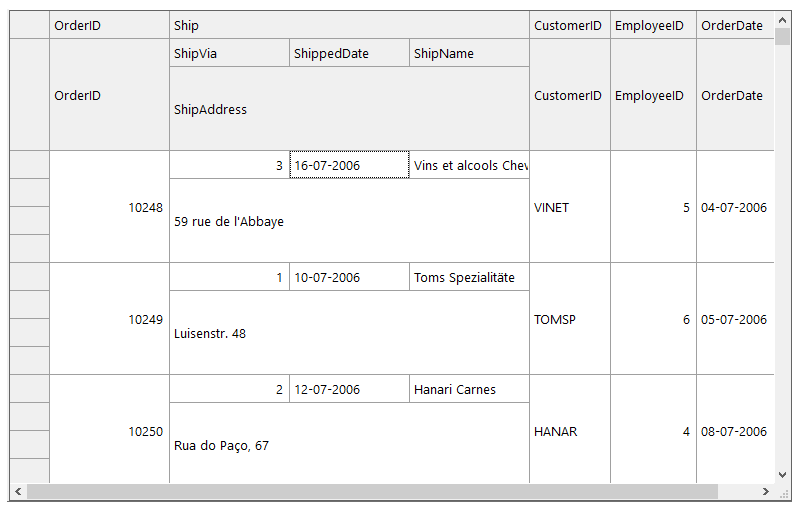
The following code snippet shows setting an advanced banded view.
| C# |
Copy Code
|
|---|---|
var bands = c1FlexGridBandedView1.Bands; bands.Add("OrderID"); var bMain = bands.Add("Ship"); bMain.ColSpan = 3; bMain.Children.Add("ShipVia"); bMain.Children.Add("ShippedDate"); bMain.Children.Add("ShipName"); var bDescription = bMain.Children.Add("ShipAddress"); bDescription.ColSpan = 3; bDescription.RowSpan = 3; bands.Add("CustomerID"); bands.Add("EmployeeID"); bands.Add("OrderDate"); |
|