Hover style is applied to FlexGrid elements such as cells, rows, or columns when the mouse is hovered over them. Adding hover styles allows you to include visual cues for the users when the mouse is hovered over the FlexGrid elements. You can set different styles such as background color, text color, border color, etc., on the hovered cells using the Styles.Hover property which allows you to get the style used to paint the hovered cell. The hover styles can be enabled by setting the HoverMode property of the C1FlexGrid class. The HoverMode property sets the grid's mouse hover highlighting behavior and specifies the type of mouse hover highlighting through HoverMode enumeration. The HoverMode enumeration provides the following options to specify the highlighting type:
| Values | Description |
|---|---|
| Cell | A single cell gets highlighted when the user hovers the mouse over it. |
| Row | A single row gets highlighted when the user hovers the mouse over it. |
| Column | A single column gets highlighted when the user hovers the mouse over it. |
| Selection | Grid elements get highlighted on mouse hover based on the selection set through the SelectionMode property. For more information on SelectionMode, see Selection. |
| None | Nothing gets highlighted in the grid. |
The following GIF demonstrates hover styling applied on one row at a time when the mouse is hovered over it.
The following code shows how to set the HoverMode property. In this example, we have set the HoverMode to Row and added the background and foreground colors for the highlighted cells in the grid.
| C# |
Copy Code
|
|---|---|
c1FlexGrid1.HoverMode = HoverMode.Row; c1FlexGrid1.Styles.Hover.BackColor = Color.LightSteelBlue; c1FlexGrid1.Styles.Hover.ForeColor = Color.Blue; |
|
Additionally, you can also apply Hover styles and change the hover mode in FlexGrid using ThemeDesigner. The image given below shows the ThemeDesigner app with the settings using which hover mode and styles can be set on FlexGrid.
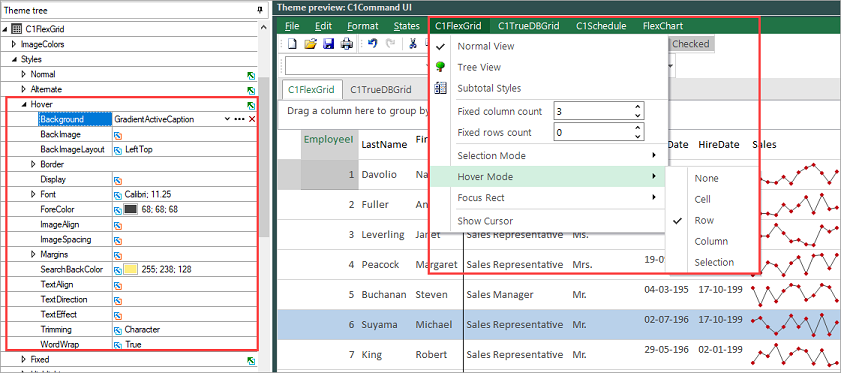
To apply Hover style and mode through the ThemeDesigner app, follow the steps: