FlexPivotChart helps to visually represent the data fetched from the data source in the form of Pivot Charts. The FlexPivotChart control integrates the features of the lightweight and fast FlexChart control in FlexPivot to render high-quality charts.

FlexPivotChart supports the following chart types.
| Chart Types | Description |
|---|---|
| Bar | A Bar chart compares values across various categories or displays variations in a data series over time. |
| Column | A Column chart, just like the Bar Chart, represents variation in a data series over time or compares different items. |
| Area | An Area chart draws data series by connecting data points against Y-axis and filling the area between the series and X-axis. |
| Line | A Line chart displays trends over a period of time by connecting different data points in a series with a straight line. |
| Scatter | The Scatter Chart, which is also known as the XY Chart, depicts relationship among items of different data series |
| Pie | Pie charts are circular graphs that display the proportionate contribution of each category which is represented by a pie or a slice. |
The FlexPivotChart class provides the UseAxisScrollbar property to set scrollbar on the x-axis or y-axis when the number of labels is large. The scrolling feature has been adapted from the FlexChart control and is useful while plotting and analyzing huge chunks of data. It lets the end-user focus on selected range of values in detail. Two scroll buttons are provided on either ends of the scrollbar to scroll through the selected range.
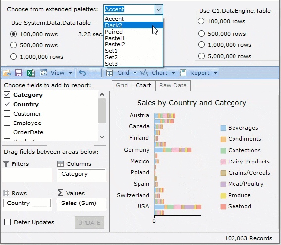
FlexPivotChart provides 16 pre-defined color palettes to choose from, so that the user can display charts matching the UI of their business applications. You can apply these palettes to FlexPivotChart using the Palette property, which accepts the values from Palette enumeration of C1.Chart namespace. This property is set to Standard by default. You can also create a custom palette using the existing color palettes.
FlexPivotchart now provides more palette options. These palettes were inspired by ColorBrewer 2 and are grouped in the following categories:
You can apply these palettes to FlexPivotChart using the CustomPalette property. Note that the chart's Palette property should be set to Custom.
| C# |
Copy Code
|
|---|---|
flexPivotChart.Palette = C1.Chart.Palette.Custom; flexPivotPage.FlexPivotChart.CustomPalette = C1.Win.Chart.Palettes.Qualitative.Pastel1; |
|
You can use a combo box to bind the palette brush data.
Observe the GIF below to see how the user can populate color brushes in FlexPivotChart from the Qualitative palette using a combo box.
The different categories of these extended palettes are useful in varying scenarios as listed below:
| Palette Type | UseCase |
| Qualitative | To show nominal or categorical data. |
| Diverging | To give equal emphasis to mid-range critical values and extremes at both ends–light colors for mid-range and dark colors for extreme low and high values. |
| SequentialSingle orSequentialMulti | To show ordered data that progress from low to highlight colors for low-data values to dark colors for high-data values. |
Axis grouping refers to the grouping of axis labels which helps in better readability and data analysis at different levels. There can be three types of data based on which implementation of axis grouping also varies: categorical, numerical and DateTime format. In FlexPivotChart, all these three implementations can be done using the ShowHierarchicalAxes property of the FlexPivotChart class.
For instance, let us assume you are using the FlexPivotChart to visually show the sales data of product sold in the world and you want to group the data on continent basis. To accomplish this, you can use the ShowHierarchicalAxes property to group the data according to continents basis. The following gif shows the same.
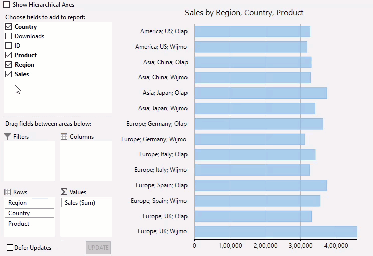
The following sample code sets the hierarchical axes in the FlexPivotChart.
| C# |
Copy Code
|
|---|---|
chart.ShowHierarchicalAxes = true;
|
|
You can use the Updating and Updated events of the FlexPivotChart class for customization of the FlexPivotChart. Updating event occurs before the FlexPivotChart starts updating, on the other hand, Updated event occurs after the FlexPivotChart finishes updating.
In the following GIF, both events are used to display label when the FlexPivotChart starts and finishes the updating process.
PivotChart supports context menu at runtime. It lets the users select different options from the context menu such as change chart type, apply stacking, copy, choose to show hide legends, titles, gridlines etc. Moreover, you can use the FlexPivotChart.ContextMenuStrip property to add, remove or edit items of the context menu.
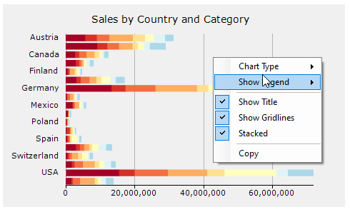
FlexPivotChart supports grouping legends using the LegendGroups property, this provides an additional context so that it is easier to compare data points. This feature is usually helpful in identifying the categories of data series in the case of multiple stacked series.
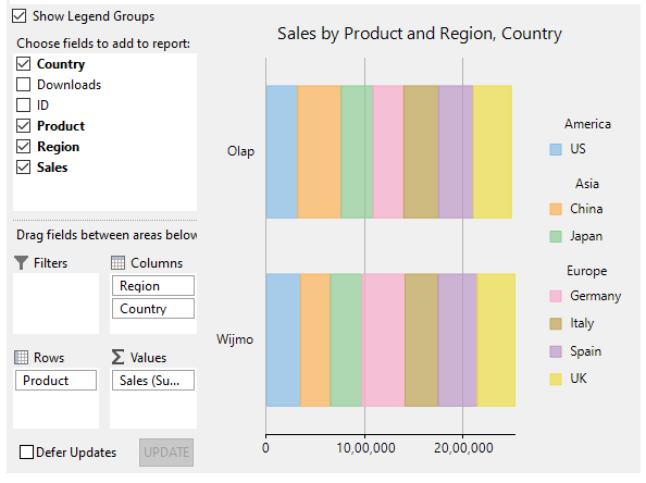
Refer the code snippet below to set the LegendGroups property.
| C# |
Copy Code
|
|---|---|
// If the property is set to true, then you can see groups in chart legend _c1FlexPivotPage.FlexPivotChart.LegendGroups = true; |
|