Input provides various properties for customizing the appearance of the Input controls, so that you can generate the control as per your requirement. The following sections provide elaborate details about appearance in Input controls.
You can add any icon, image, background image, different font styles for text and even change the alignment of image or text as per your need. The C1ButtonBase class provides the appearance-related properties to alter the appearance of the button control in the most convenient manner.
You can assign values to these properties via the Properties window or implement them programmatically in the code editor as well.
The following code snippet shows how to add a background image to the button control using the BackgroundImage property by calling the FromFile method in the Image class to create an image from the specified file.
| C# |
Copy Code
|
|---|---|
button.Text = "Submit"; button.Font = new System.Drawing.Font("Arial", 11F, ((System.Drawing.FontStyle)((System.Drawing.FontStyle.Bold | System.Drawing.FontStyle.Italic)))); button.BackgroundImage = Image.FromFile(@"resources\blue-blurred-backimage.jpg"); button.Cursor = Cursors.Hand; |
|
The resulting image looks like this:

You can set icons or images in the button control, and change its alignment using the ImageAlign property. Further, the text can be aligned with respect to the image using the TextAlign property. The ImageAlign and TextAlign properties access the ContentAlignment enumeration to set different alignments in the button control.
The following code snippet can be used to add an icon to the button control using the Icon property:
| C# |
Copy Code
|
|---|---|
// Set an icon in button control button.Text = "Submit"; button.TextAlign = ContentAlignment.TopRight; button.Icon = new C1.Framework.C1BitmapIcon(null, new System.Drawing.Size(16, 16), System.Drawing.Color.Transparent, Image.FromFile(@"Resources\emerald-theme-manager-icon-icon.png")); button.ImageAlign = ContentAlignment.TopLeft; |
|
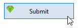
The following code snippet can be used to add an image to the button control using the Image property:
| C# |
Copy Code
|
|---|---|
// Set an image in button control button.Text = "Submit"; button.Image = Image.FromFile(@"Resources\emerald-theme-manager-icon-icon.png"); button.ImageAlign = ContentAlignment.TopLeft; |
|
The resulting image looks like this:
Let's explore how to use appearance properties to enrich the appearance of the CheckBox control.
You can add any icon, image, background image, different font styles for text and even change the alignment of image or text as per your need. The C1CheckBox class provides the appearance-related properties to alter the appearance of the control in the most convenient manner.

The following code snippet shows how to add a background image to the CheckBox control using the BackgroundImage property by calling the FromFile method in the Image class to create an image from the specified file, and add an icon to the checkbox using the C1BitmapIcon class.
| C# |
Copy Code
|
|---|---|
checkBox.Text = "Enable"; checkBox.TextAlign = ContentAlignment.MiddleLeft; checkBox.BackgroundImage = Image.FromFile(@"Resources\blue-blurred-backimage.jpg"); checkBox.Icon = new C1.Framework.C1BitmapIcon(null, new System.Drawing.Size(16, 16), System.Drawing.Color.Transparent, Image.FromFile(@"Resources\emerald-theme-manager-icon-icon.png")); checkBox.Font = new System.Drawing.Font("Segoe UI", 10F, System.Drawing.FontStyle.Bold, System.Drawing.GraphicsUnit.Point); |
|
Let's explore how to use appearance properties to enrich the appearance of the CheckBox control.
You can add any icon, image, background image, different font styles for text and even change the alignment of image or text as per your need. The C1CheckBox class provides the appearance-related properties to alter the appearance of the control in the most convenient manner.
The following code snippet shows how to add a background image to the CheckBox control using the BackgroundImage property by calling the FromFile method in the Image class to create an image from the specified file, and add an icon to the checkbox using the C1BitmapIcon class.
| C# |
Copy Code
|
|---|---|
checkBox.Text = "Enable"; checkBox.TextAlign = ContentAlignment.MiddleLeft; checkBox.BackgroundImage = Image.FromFile(@"Resources\blue-blurred-backimage.jpg"); checkBox.Icon = new C1.Framework.C1BitmapIcon(null, new System.Drawing.Size(16, 16), System.Drawing.Color.Transparent, Image.FromFile(@"Resources\emerald-theme-manager-icon-icon.png")); checkBox.Font = new System.Drawing.Font("Segoe UI", 10F, System.Drawing.FontStyle.Bold, System.Drawing.GraphicsUnit.Point); |
|