The text-based controls in Input like, TextBox, MaskedTextBox, ComboBox, NumericEdit, DateEdit and DropDownControl, facilitate the use of different button types, such as UpDown Button, Modal button and Custom Button.
With the DropDown button, you can display a dropdown form with list of items when clicked.
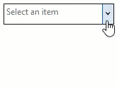
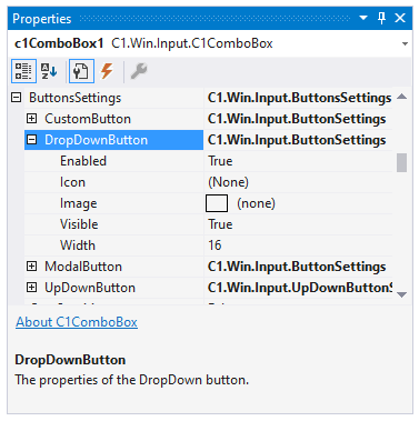
You can set an DropDown button in the control by navigating to the ButtonSettings and DropDownButton in the Properties window, and setting the Enabled and Visible properties to true.
With an UpDown button, you can increment or decrement a value in the TextBox. You can set an UpDown button in the control by navigating to the ButtonSettings and UpDownButton in the Properties window, and setting the Enabled and Visible properties to true.
There are three types of UpDown buttons:
| UpDown button types | Snapshots |
| Default | 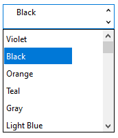 |
| UpLeftDownRight | 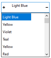 |
| UpRightDownLeft | 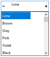 |
You can set an Modal button in the control by navigating to the ButtonSettings and ModalButton in the Properties window, and setting the Enabled and Visible properties to true.
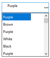
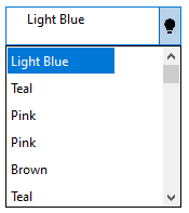
You can set an Custom button in a control by navigating to the ButtonSettings and CustomButton in the Properties window. You can add an image for the custom dropdown icon using the Image property. To make the custom button visible, set the Enabled and Visible properties to true.