Input provides various properties for customizing the appearance and styling the CheckBox control, so that you can generate the control as per your requirement. The following sections provide elaborate details about appearance and styling in CheckBox.
Let's explore how to use appearance properties to enrich the appearance of the CheckBox control.
You can add any icon, image, background image, different font styles for text and even change the alignment of image or text as per your need. The C1CheckBox class provides the appearance-related properties to alter the appearance of the control in the most convenient manner.
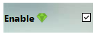
The following code snippet shows how to add a background image to the CheckBox control using the BackgroundImage property by calling the FromFile method in the Image class to create an image from the specified file, and add an icon to the checkbox using the C1BitmapIcon class.
| C# |
Copy Code
|
|---|---|
checkBox.Text = "Enable"; checkBox.TextAlign = ContentAlignment.MiddleLeft; checkBox.BackgroundImage = Image.FromFile(@"Resources\blue-blurred-backimage.jpg"); checkBox.Icon = new C1.Framework.C1BitmapIcon(null, new System.Drawing.Size(16, 16), System.Drawing.Color.Transparent, Image.FromFile(@"Resources\emerald-theme-manager-icon-icon.png")); checkBox.Font = new System.Drawing.Font("Segoe UI", 10F, System.Drawing.FontStyle.Bold, System.Drawing.GraphicsUnit.Point); |
|
Let's explore how to use styling properties to style the UI of the CheckBox control. The C1CheckBox class provides the BackColor and ForeColor properties to set the background and foreground colors, respectively. Besides these, it also provides the Styles property to apply styling to different states of checkbox such as Default, Disabled, Hot, HotPressed, and Pressed.
The following image showcases styling applied to the Checkbox control.

The following code snippet shows how to set the styling properties in the CheckBox control using the BackColor, ForeColor, Glyph, and Styles properties.
| C# |
Copy Code
|
|---|---|
//Style Checkbox check_box.BackColor = System.Drawing.Color.Tan; check_box.ForeColor = System.Drawing.SystemColors.ControlLightLight; //Style font check_box.Font = new System.Drawing.Font("Segoe UI", 11F, System.Drawing.FontStyle.Regular, System.Drawing.GraphicsUnit.Point); //Style Glyph check_box.Styles.Normal.Glyph.Checked.Default.BackColor = System.Drawing.Color.Red; check_box.Styles.Normal.Glyph.Checked.Hot.BackColor = System.Drawing.Color.Bisque; check_box.Styles.Normal.Glyph.Unchecked.Default.BackColor = System.Drawing.SystemColors.GradientInactiveCaption; check_box.Styles.Normal.Glyph.Unchecked.Hot.BackColor = System.Drawing.Color.Yellow; check_box.Styles.Normal.Glyph.Unchecked.HotPressed.BackColor = System.Drawing.Color.Yellow; |
|