Input provides various properties for customizing the appearance and styling the Label control, so that you can generate Input Label as per your requirement and change the look and feel of the application you are creating.
You can add any background image, forecolor, font settings etc. and even change the text alignment and image layout as per your need.
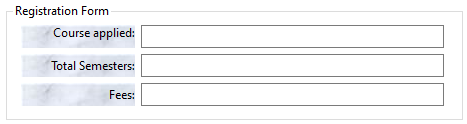
The following code snippet shows how to add a background image, change font settings and text or image alignment:
| C# |
Copy Code
|
|---|---|
// Enhancing the appearance of first label label1.BackgroundImage = Image.FromFile(@"Resources\blurredimage.jpg"); label1.BackgroundImageLayout = System.Windows.Forms.ImageLayout.Center; label1.Font = new System.Drawing.Font("Segoe UI", 9F, System.Drawing.FontStyle.Regular, System.Drawing.GraphicsUnit.Point); label1.ForeColor = System.Drawing.Color.White; label1.Location = new System.Drawing.Point(15, 22); label1.Size = new System.Drawing.Size(114, 23); label1.TabIndex = 18; label1.Text = "Course applied:"; label1.TextAlign = System.Drawing.ContentAlignment.TopRight; // Enhancing the appearance of second label label2.BackgroundImage = Image.FromFile(@"Resources\blurredimage.jpg"); label2.BackgroundImageLayout = System.Windows.Forms.ImageLayout.Center; label2.Font = new System.Drawing.Font("Segoe UI", 9F, System.Drawing.FontStyle.Regular, System.Drawing.GraphicsUnit.Point); label2.ForeColor = System.Drawing.Color.White; label2.Location = new System.Drawing.Point(15, 51); label2.Size = new System.Drawing.Size(114, 23); label2.TabIndex = 20; label2.Text = "Total Semesters:"; label2.TextAlign = System.Drawing.ContentAlignment.MiddleRight; // Enhancing the appearance of third label label3.BackgroundImage = Image.FromFile(@"Resources\blurredimage.jpg"); label3.BackgroundImageLayout = System.Windows.Forms.ImageLayout.Center; label3.Font = new System.Drawing.Font("Segoe UI", 9F, System.Drawing.FontStyle.Regular, System.Drawing.GraphicsUnit.Point); label3.ForeColor = System.Drawing.Color.White; label3.Location = new System.Drawing.Point(15, 80); label3.Size = new System.Drawing.Size(114, 23); label3.TabIndex = 21; label3.Text = "Fees:"; label3.TextAlign = System.Drawing.ContentAlignment.MiddleRight; |
|
The C1Label class provides the BackColor and ForeColor properties to set the background and foreground colors, respectively. Besides these, it also provides the Styles property to apply styling to different states of label such as Default, Disabled, Hot, HotPressed, and Pressed.
The following image showcases styling applied to the Label control.

The following code snippet shows how to set the styling properties in the Label control. Here, we apply styling to the label control by setting the background color, foreground color, and borders.
| C# |
Copy Code
|
|---|---|
// Styling label c1Label1.Font = new System.Drawing.Font("Segoe UI", 11F, System.Drawing.FontStyle.Italic, System.Drawing.GraphicsUnit.Point); c1Label1.ForeColor = System.Drawing.Color.Purple; c1Label1.BackColor = System.Drawing.Color.Lavender; //Set borders c1Label1.Styles.Border = new C1.Framework.Thickness(2, 2, 2, 2); c1Label1.Styles.Default.BorderColor = Color.Purple; c1Label1.Styles.Corners = new C1.Framework.Corners(5, 5, 5, 5); |
|