A placeholder lets you show text in a control when nothing is selected or displayed in it. This text disappears as soon as a value is entered in the control.
The text-based controls in Input like, TextBox, MaskedTextBox, ComboBox, NumericEdit, DateEdit and DropDownControl, have a common Placeholder property. This will enable the users to add a placeholder text to a control using the Placeholder property through the Properties window, or via code.
The Placeholder property is a member of the C1DropDownEditorBase, a base class, which is used to represent drop-down controls with text editors. Similarly, the property is available in class of all the controls mentioned above.
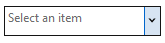
The code below shows an example of configuring Placeholder in the ComboBox control:
| C# |
Copy Code
|
|---|---|
comboBox.Placeholder = "Select an item";
|
|
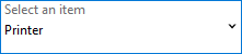
FloatingPlaceholderEnabled is a common property in text-based controls that, when set to true, makes the placeholder text behave as a control label for the control. This property allows the placeholder text in the control's text area to move and make space for the user to add content at runtime. However, the size of the control must be large enough to fit both the placeholder text and the user content. So, you need to set the size of the control using the MinimumSize property based on your requirements.
The following image shows floating placeholder in the C1ComboBox control.
The code below shows example of adding a floating placeholder in the ComboBox control:
| C# |
Copy Code
|
|---|---|
c1ComboBox1.Placeholder = "Select an item"; c1ComboBox1.MinimumSize = new System.Drawing.Size(150, 50); c1ComboBox1.FloatingPlaceholderEnabled = true; |
|