Input provides various properties to customize the appearance and styling the Input control, so that you can generate the RangeSlider control as per your requirement and change the look and feel of the application you are creating.
You can change the background image, font and forecolor of the RangeSlider control.

The code below depicts adding appearance-related properties in RangeSlider:
| C# |
Copy Code
|
|---|---|
// changing the appearance of RangeSlider c1RangeSlider1.BackgroundImage = Image.FromFile(@"Resources\OIP (2).jpg"); c1RangeSlider1.BackgroundImageLayout = System.Windows.Forms.ImageLayout.Stretch; c1RangeSlider1.Font = new System.Drawing.Font("Segoe UI", 9F, System.Drawing.FontStyle.Bold, System.Drawing.GraphicsUnit.Point); c1RangeSlider1.ForeColor = System.Drawing.Color.RoyalBlue; c1RangeSlider1.LargeChange = 5D; c1RangeSlider1.LowerValue = 0D; c1RangeSlider1.Maximum = 50D; c1RangeSlider1.Minimum = 0D; c1RangeSlider1.UpperValue = 25D; |
|
The C1RangeSlider class provides the Styles property to style the UI of the control, such as the bar, thumb and common regions.
The following image showcases styling applied to the RangeSlider control.
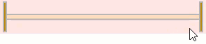
The RangeSliderBarStyle class provides the BackColor and ForeColor properties to set the background and foreground colors, respectively. Besides this, it also provides RangeSliderCommonStyle class to determine the general appearance of the range slider bar on the screen. Furthermore, the Styles property can be used to apply styling to different states of the control such as Default, Disabled, Hot, HotPressed, and Pressed.
To apply styling to the RangeSlider control, use the following code. Here, we apply styling to the control and its elements by setting background color, foreground color, and borders.
| C# |
Copy Code
|
|---|---|
// Style the RangeSlider control c1RangeSlider1.BackColor = System.Drawing.Color.MistyRose; c1RangeSlider1.ForeColor = System.Drawing.Color.DarkGreen; c1RangeSlider1.Styles.Common.BorderColor = System.Drawing.Color.Gray; //Style bar c1RangeSlider1.Styles.Bar.Border = 2; c1RangeSlider1.Styles.Bar.Default.BackColor = System.Drawing.Color.DarkGray; c1RangeSlider1.Styles.Bar.Selected.BackColor = System.Drawing.Color.PeachPuff; //Style thumb c1RangeSlider1.Styles.Thumb.Border = new C1.Framework.Thickness(2, 2, 2, 2); c1RangeSlider1.Styles.Thumb.Default.BackColor = System.Drawing.Color.DarkGoldenrod; c1RangeSlider1.Styles.Thumb.Hot.BackColor = System.Drawing.Color.Chartreuse; |
|