You can use the ItemMode property to build item presentation.
There are three options which include the following:
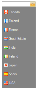
Default
In the default option, each C1ComboBoxItem is a string and can also be an image.
The following image illustrates a C1ComboBox with the Default option:
For an example see the ComboBoxImages sample.
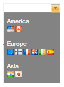
HtmlPattern
In the HtmlPattern, each item is built from a HTML pattern and bound item data.
The following image illustrates a C1ComboBox with the HtmlPattern:
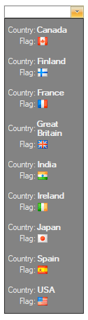
The HtmlPattern used above is set to the following: <table><tr><td>Country:</td><td><b>{Text}</b></td></tr><tr><td align="right">Flag:</td><td><img src='{Text}'></td></tr></table>
For an example see the ComboBoxItemModes sample.
Html
In the Html option, each item is a fragment of a HTML subset.
The following image illustrates a C1ComboBox with the Html option:
The Html used above is set to the following:
For an example see the ComboBoxItemModes sample.