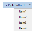
 The SplitButton control lets the user execute an action that is bound to a button or select a predefined action from a dropdown list of items. It consists of a main button and a dropdown as showcased in the following image.
Let us explore more about C1SplitButton in the following sections.
In SplitButton, the dropdown items in SplitButton are represented by the DropDownItem class. This class provides various properties such as Text, Visible, and Image for customizing dropdown items.
To configure dropdown items and add them to SplitButton, use the following code. In this example, we create three dropdown items, set their text using the Text property and add these items to the SplitButton control using Add method of the DropDownItemCollection class .
| C# |
Copy Code
|
|---|---|
DropDownItem item1 = new DropDownItem(); DropDownItem item2 = new DropDownItem(); DropDownItem item3 = new DropDownItem(); item1.Text = "Item1"; item2.Text = "Item2"; item3.Text = "Item3"; //add items to SplitButton this.c1SplitButton1.Items.Add(item1); this.c1SplitButton1.Items.Add(item2); this.c1SplitButton1.Items.Add(item3); |
|
Alternatively, you can use SplitButtonItem Collection Editor to configure dropdown items at design time. SplitButtonItem Collection Editor allows you to add items and modify various properties at design time. You can access it by clicking the smart tag icon ( ) in the upper right corner of the SplitButton. The SplitButtonItem Collection Editor window appears as follows.
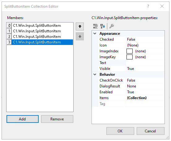
In the SplitButtonItem Collection Editor window, the right pane displays properties for each dropdown item. The left pane displays a list of items along with Add and Remove buttons to add and remove items, respectively.
SplitButton enables you to customize the dropdown items by using ItemStyle property of the C1SplitButton class. The ItemStyle property lets you set the background color, foreground color, arrow color, and much more using BackColor, ForeColor, and ArrowColor properties of the DropDownItemStyle class. Besides these, it lets you apply styling on a particular state of the button like disabled and hot state.
The following image showcases styling applied to SplitButton.
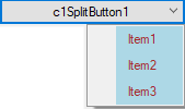
To customize the dropdown of SplitButton, use the following code. Here, we set the background and foreground color of the dropdown using BackColor and ForeColor properties, respectively.
| C# |
Copy Code
|
|---|---|
 //Customize dropdown
c1SplitButton1.ItemStyle.BackColor = Color.LightBlue;
c1SplitButton1.ItemStyle.ForeColor = Color.Brown;
|
|