The Check Keyboard Accelerators designer lets you check and clear the accelerators for each item on the InputPanel control. You can access the designer by clicking the Check Accelerators option in the task menu or the context menu.
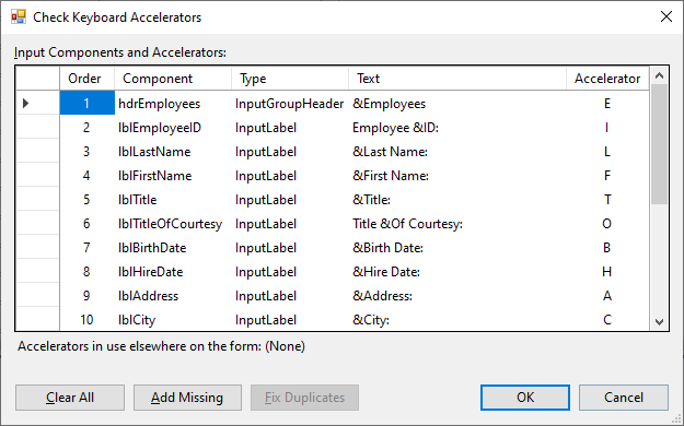
When you add an input component to InputPanel, it is automatically added to the Check Keyboard Accelerator designer. Typically, default key accelerator is the first character of Text value of that input component.
If you have several Input components with all having the same value for their Text property, then the automatic Add Missing button uses a different letter from the Text value for each input component. If every character from the Text value has been assigned, InputPanel does not assign an accelerator. You need to enter a unique key accelerator for it in the accelerator field of the designer. An error image appears along with a warning message if you entered a duplicate key accelerator. Clicking on the Fix Duplicates button automatically fixes all duplicate key accelerators by assigning unique key accelerators for each one. The designer also allows you to clear all the assigned accelerators.
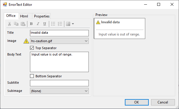
ErrorText Editor provides an interface to create HTML based error messages that are displayed in the case of invalid input. The editor provides three tabs named Office, HTML and Properties to edit the content, source and properties of the error message respectively. The Office and Html tab come with a quick tool bar to facilitate smooth formatting of the error message. Not just that, you also get a Preview pane on right hand side of the editor to get a real-time preview of the final error message.
You can access the editor by clicking the ellipsis button against ErrorText property of the InputPanel components in the Property window. The ErrorText property is specific to the InputPanel item, so you can create an error message for each field.
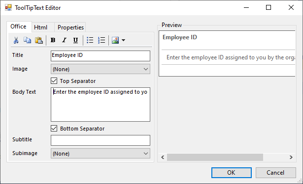
The ToolTipText Editor is very similar to the ErrorText Editor in its purpose, layout and its usage. As the name suggests, the editor is for designing the rich tooltips for each InputPanel item. Just like ErrorText Editor, the editor also provides Office, HTML and Properties tabs on left hand side and a Preview pane on right hand side. For more information about the layout, see Error Text Editor.
You can access the editor by clicking the ellipsis button against ToolTipText property of the InputPanel items in the Property window.
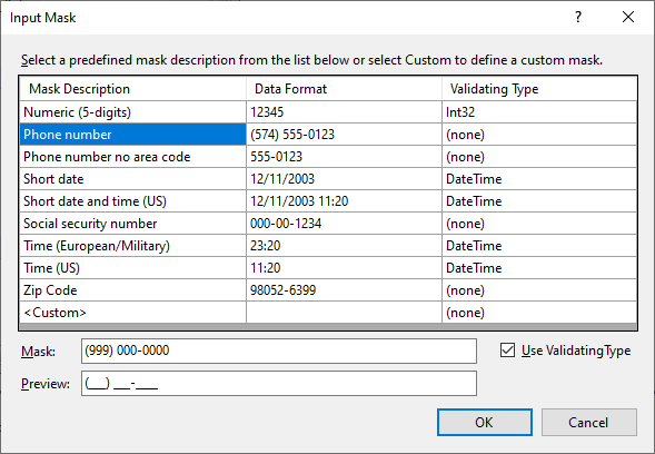
The Input Mask dialog provides a list of pre-defined masks, their description and validation type which you can select to set the mask to one of them. In case you want to define your own mask, you can select <Custom> from the list and define your own mask in the Mask field. The Preview field shows preview of the mask.
You can access the Input Mask dialog by clicking the ellipsis button available alongside Mask property of the InputMask component.
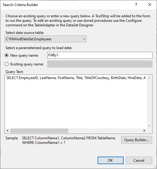
The Search Criteria Builder dialog, similar to the one that appears in case of data adapter, lets you specify a query to load selective data in the grid. It lets you select the data source table and gives you option to create a new query or re-use an existing one. The dialog also consists of a Query Builder... button which opens a dialog to create a query using a designer.
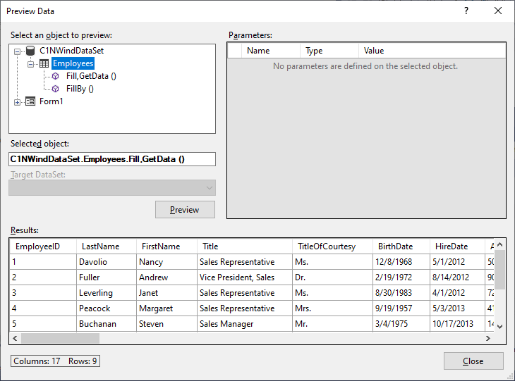
The Preview Data dialog, similar to the one that appears in case of data adapter, lets you preview grid displaying data of the selected object. The dialog comes with three panes, one displaying structure of data source from where you can select the data, another displaying the parameters defined for the object and third one displays the resultant grid for the selected object on pressing the Preview button. The dialog also lets you select the target dataset.