Borders and Dividing Lines
In This Topic
The RowDivider and ColumnDivider properties enable you to choose different horizontal and vertical lines and set their colors. They return an underlying GridLines object which has two properties. These two properties, Style and Color define how the list's cell borders will look. The allowable values for the Style property are as follows:
| Setting | Description |
|---|---|
| Double | A double line. |
| Insert | A line with a three-dimensional inset appearance. |
| None | No line. |
| Raised | A line with a three-dimensional raised appearance. |
| Single | A single line. |
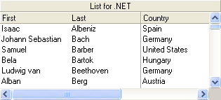
For example, the default setting of the style property of RowDivider to LineStyleEnum.None eliminates the dividing lines between rows and enables you to view slightly more data in the available area.
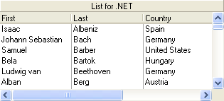
For ColumnDivider properties, you can set the Style property toNone and the HeaderDivider property to False. This enables you to visually group related columns, as shown in the following figure.