Through the Grid Header node of the Visual Style dialog box, you can set properties for the grid header.
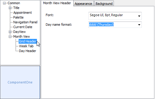
The following properties are available through the Grid Header node:
| Tab | Property | Description |
|---|---|---|
| Month View Header | Font | Sets the font for the month view header. |
| Day name format | Sets the date format for the header. Available formats include: dddd - Displays the full name of each day. For example, Thursday. ddd - Displays the 3-letter abbreviated name for each day. For example, Thu. | |
| Appearance | Text color | Sets the text color for the header. |
| Padding | Sets the padding around the header. | |
| Border | Sets the border width for the header. | |
| Border color | Sets the border color for the header. | |
| Alignment | Sets the alignment for the header text. | |
| Background | Background color | Sets the background color for the header. |
| Gradient color | Sets the background gradient color. | |
| Gradient | Sets the background gradient mode. | |
| Gamma correction | Applies gamma correction to the background gradient when checked. | |
| Gradient center | Sets the center of the gradient background. | |
| Gradient blend | Sets the Drawing.Drawing2D.Blend used to paint the background gradient. | |
| Image | Sets the background image. |