Through the Time Ruler node of the Visual Style dialog box, you can set the font and border properties for the time ruler.
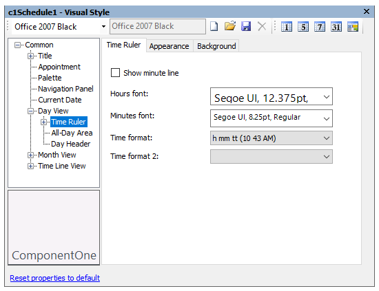
The following properties are available through the Time Ruler node:
| Tab | Property | Description |
|---|---|---|
| Time Ruler | Show minute line | Displays the minute line when checked. |
| Hours font | Sets the font for the hours. | |
| Minutes font | Sets the font for the minutes. | |
| Time format |
Sets the format for the time. Available formats include:
|
|
| Appearance | Text color | Sets the text color for the time ruler. |
| Padding | Sets the padding around the time text. | |
| Border | Sets the border width for the time ruler. | |
| Border color | Sets the border color for the time ruler. | |
| Alignment | Sets the alignment for the time ruler text. | |
| Background | Background color | Sets the background color for the time ruler. |
| Gradient color | Sets the background gradient color. | |
| Gradient | Sets the background gradient mode. | |
| Gamma correction | Applies gamma correction to the background gradient when checked. | |
| Gradient center | Sets the center of the gradient background. | |
| Gradient blend | Sets the Drawing.Drawing2D.Blend used to paint the background gradient. | |
| Image | Sets the background image. |