Sparklines for WinForms | ComponentOne
Work with Sparkline Control / Styling
In This Topic
    Styling
    In This Topic

    We can customize the appearance of the Sparkline control, such as the color of the axis, color of the data points and color of the series, by using the Styles property provided by the C1Sparkline class, which returns an object of the SparklineTheme class. To customize the color of the horizontal axis and the series, use the AxisColor and SeriesColor properties provided by the SparklineTheme class.

    Additionally, you can change the distance between two bars of a column/winloss sparkline with the help of the BarDistance property. The LineWeight property can be used to change the thickness of the sparkline lines in a line sparkline by specifying the desired line weight in points.

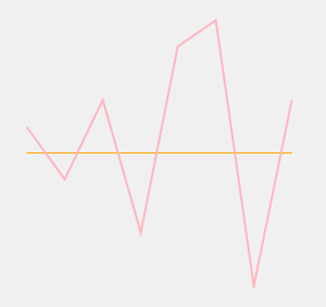
    The following image shows how Sparkline appears after applying styles.

    Colored sparkline

    The following code example shows how you can apply styles to the Sparkline control.

    c1Sparkline1.Styles.AxisColor = Color.Orange
        c1Sparkline1.Styles.BarDistance = 30
        c1Sparkline1.Styles.SeriesColor = Color.LightPink
        c1Sparkline1.Styles.LineWeight = 2
        c1Sparkline1.Styles.FirstMarkerColor = Color.Yellow
    
    //Sets the color of the axis
    c1Sparkline1.Styles.AxisColor = Color.Orange;
    //Sets the distance between two bars of a bar sparkline
    c1Sparkline1.Styles.BarDistance = 30;
    //Sets the color of the sparkline
    c1Sparkline1.Styles.SeriesColor = Color.LightPink;
    //Sets the line weight
    c1Sparkline1.Styles.LineWeight = 2;
    //Sets the color of the first data point
    c1Sparkline1.Styles.FirstMarkerColor = Color.Yellow;