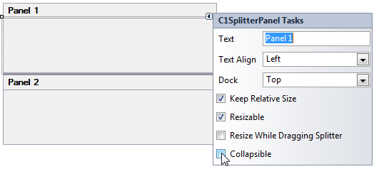
The panels in C1SplitContainer can easily be collapsed or expanded by setting the Collapsible property to True (see Adding a ToolTip to the Collapsed Splitter Panel). Once the property is set, you can click on the expander button to collapse or expand the panels.
The following image illustrates Panel1's Collapsible property set to True:
When the Collapsible property is set to True you can enter text for the collapsed or collapsing tooltip using the CollapsedToolTip and CollapsingToolTip properties.
The following image shows the default tooltip when you hover over the expanded button:
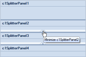
When you hover over the expander button of a minimized panel the default tooltip text will read, expand panel.