This quick start guide explains how to add two Microsoft stylized C1SuperTooltips and a C1SuperLabel control to your form.
Step 1 of 4: Adding a C1SuperLabel to a Project
Start by adding a C1SuperLabel control to your project and adding some HTML code for it.
To add a C1SuperLabel to a project, complete the following steps:
Click here for the HTML code to add in the text box.
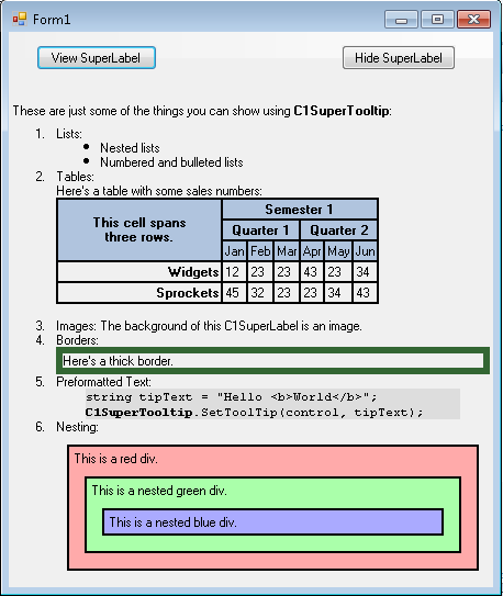
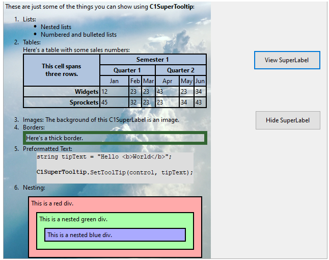
These are just some of the things you can show using <b>C1SuperTooltip</b>:
<ol>
<li>Lists:</li>
<ul>
<li>Nested lists</li>
<li>Numbered and bulleted lists</li>
</ul>
<li>Tables:<p>Here's a table with some sales numbers:</p>
<table border='1' bordercolor='black' cellpadding='2' cellspacing='0' style='border:solid 1 black;'>
<tr bgcolor='LightSteelBlue'>
<th style="width:150px; text-align: center;" rowspan='3'>
<p>This cell spans<br />three rows.</p></th>
<th align='center' colspan='6'>Semester 1</th>
</tr>
<tr bgcolor='LightSteelBlue'>
<th align='center' colspan='3'>Quarter 1</th>
<th align='center' colspan='3'>Quarter 2</th>
</tr>
<tr bgcolor='LightSteelBlue'>
<td align='center'>Jan</td>
<td align='center'>Feb</td>
<td align='center'>Mar</td>
<td align='center'>Apr</td>
<td align='center'>May</td>
<td align='center'>Jun</td>
</tr>
<tr>
<td align='right' style='width: 150px'><strong>Widgets</strong></td>
<td>12</td>
<td>23</td>
<td>23</td>
<td>43</td>
<td>23</td>
<td>34</td>
</tr>
<tr>
<td align='right' style='width: 150px'><strong>Sprockets</strong></td>
<td>45</td>
<td>32</td>
<td>23</td>
<td>23</td>
<td>34</td>
<td>43</td>
</tr>
</table>
</li>
<li>Images: The background of this C1SuperLabel is an image. </li>
<li>Borders:<p style='border: #336633 thick'>Here's a thick border.</p>
</li>
<li>Preformatted Text:
<pre style="background-color:#dddddd; margin:0 20pt 0 20pt;">
string tipText = "Hello <b>World</b>";
<b>C1SuperTooltip</b>.SetToolTip(control, tipText);
</pre>
</li>
<li>Nesting:
<div style="background-color:#ffaaaa;border:solid thin black;margin:10px;padding:4px">
This is a red div.
<div style="background-color:#aaffaa;border:solid thin black;margin:10px;padding:4px">
This is a nested green div.
<div style="background-color:#aaaaff;border:solid thin black;margin:10px;padding:4px">
This is a nested blue div.
</div>
</div>
</div>
</li>
</ol>
Step 2 of 4: Creating a stylized C1SuperTooltip for a Control
Next, create a Microsoft stylized C1SuperTooltip using the Office tab in the C1SuperTooltip Editor. To do this, complete the following steps:
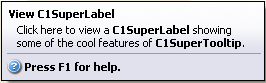
Click here to view a C1SuperLabel showing some of the cool features of C1SuperTooltip.
Notice a preview of the C1SuperTooltip appears in the Preview window.
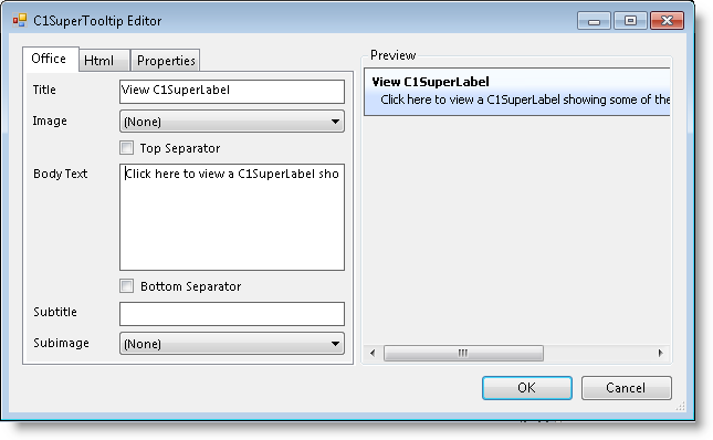
Press F1 for more help.
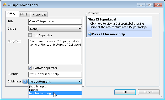
Note that C1SuperTooltip automatically creates the HTML used to format your ToolTip so you don't have to. To view the HTML code, click the Html tab. We will create a ToolTip using only HTML code in the Creating a C1SuperTooltip with HTML Code topic of this quick start.
Step 3 of 4: Creating a C1SuperTooltip with HTML Code
Then create a C1SuperTooltip in the C1SuperTooltip Editor using only HTML code. Complete the following steps:
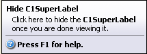
<table><tr>
<parm></parm>

  <th><parm>Hide C1SuperLabel</parm></th>

</table>

<parm></parm>

<div style='margin:1 12'><parm>
  Click here to hide the <b>C1SuperLabel</b><br>once you are done viewing it.

</parm></div>

<parm><hr noshade size=1 style='margin:2' color=Darker></parm>

<table><tr>

  <th><parm><img src='HelpButton.png'></parm></th>

  <th><parm>Press F1 for help.</parm></th>


</table>
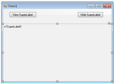
Step 4 of 4: Adding Code for the Buttons and Running the Project
Once you have created the C1SuperLabel and C1SuperTooltips, you can add code for the buttons on the form and run the project. To do this, complete the following steps:
To write code in Visual Basic
| Visual Basic |
Copy Code
|
|---|---|
C1SuperLabel1.Visible = True |
|
To write code in C#
| C# |
Copy Code
|
|---|---|
c1SuperLabel1.Visible = true; |
|
To write code in Visual Basic
| Visual Basic |
Copy Code
|
|---|---|
C1SuperLabel1.Visible = False |
|
To write code in C#
| C# |
Copy Code
|
|---|---|
c1SuperLabel1.Visible = False; |
|

The text in the ToolTip for Button2 was applied through HTML markup, but you will notice the C1SuperTooltip Vista background style appears in both ToolTips. Any properties you set via the C1SuperTooltip Editor will be the same in all ToolTips for controls associated with that C1SuperTooltip.
Create a new Windows Forms application.
In Solution Explorer, right-click Dependencies and choose Manage NuGet Packages. Add C1.Win and C1.Win.SuperTooltip .NET packages.
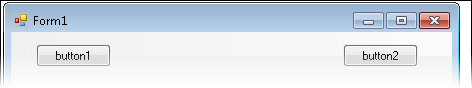
Add two buttons by amending these changes in their properties.
| Button | Button.Name property | Button.Text property |
| 1 | btn_viewLabel | View SuperLabel |
| 2 | btn_hideLabel | Hide SuperLabel |
Switch to code editor and initialize the C1SuperLabel object.
| C# |
Copy Code
|
|---|---|
// Initialize C1SuperLabel object
C1SuperLabel superLabel;
|
|
Add SuperLabel programmatically:
| C# |
Copy Code
|
|---|---|
// Adding super label programmatically superLabel = new C1SuperLabel(); this.Controls.Add(superLabel); |
|
Add the string HtmlTextin the resource file SuperLabelResource.resx.
| C# |
Copy Code
|
|---|---|
These are just some of the things you can show using <b>C1SuperTooltip</b>: <ol> <li>Lists:</li> <ul> <li>Nested lists</li> <li>Numbered and bulleted lists</li> </ul> <li>Tables:<p>Here's a table with some sales numbers:</p> <table border='1' bordercolor='black' cellpadding='2' cellspacing='0' style='border:solid 1 black;'> <tr bgcolor='LightSteelBlue'> <th style="width:150px; text-align: center;" rowspan='3'> <p>This cell spans<br />three rows.</p></th> <th align='center' colspan='6'>Semester 1</th> </tr> <tr bgcolor='LightSteelBlue'> <th align='center' colspan='3'>Quarter 1</th> <th align='center' colspan='3'>Quarter 2</th> </tr> <tr bgcolor='LightSteelBlue'> <td align='center'>Jan</td> <td align='center'>Feb</td> <td align='center'>Mar</td> <td align='center'>Apr</td> <td align='center'>May</td> <td align='center'>Jun</td> </tr> <tr> <td align='right' style='width: 150px'><strong>Widgets</strong></td> <td>12</td> <td>23</td> <td>23</td> <td>43</td> <td>23</td> <td>34</td> </tr> <tr> <td align='right' style='width: 150px'><strong>Sprockets</strong></td> <td>45</td> <td>32</td> <td>23</td> <td>23</td> <td>34</td> <td>43</td> </tr> </table> </li> <li>Images: The background of this C1SuperLabel is an image. </li> <li>Borders:<p style='border: #336633 thick'>Here's a thick border.</p> </li> <li>Preformatted Text: <pre style="background-color:#dddddd; margin:0 20pt 0 20pt;"> string tipText = "Hello <b>World</b>"; <b>C1SuperTooltip</b>.SetToolTip(control, tipText); </pre> </li> <li>Nesting: <div style="background-color:#ffaaaa;border:solid thin black;margin:10px;padding:4px"> This is a red div. <div style="background-color:#aaffaa;border:solid thin black;margin:10px;padding:4px"> This is a nested green div. <div style="background-color:#aaaaff;border:solid thin black;margin:10px;padding:4px"> This is a nested blue div. </div> </div> </div> </li> </ol> |
|
Add background image to the SuperLabel.
| C# |
Copy Code
|
|---|---|
// Adding background image
superLabel.BackgroundImage = SuperLabelResource.BackgroundImage;
superLabel.BackgroundImageLayout = C1.Win.SuperTooltip.BackgroundImageLayout.Stretch;
|
|
Add Vista-style SuperTooltip using the BackgroundGradient and Images properties of C1SuperTooltipBase class. Choose the background gradient using the BackgroundGradient enumeration :
| C# |
Copy Code
|
|---|---|
// **Stylized super tool tip ** // Adding Image to super tooltip. C1SuperTooltip superTooltip = new C1SuperTooltip(); superTooltip.Images.Add(new ImageEntry("HelpIcon", SuperLabelResource.HelpIcon)); superTooltip.BackgroundGradient = BackgroundGradient.Vista; |
|
Call the ShowLabelClick and the HideLabelClick events, and add the codes as below:
| C# |
Copy Code
|
|---|---|
// show super label. private void ShowLabelClick(object sender, EventArgs e) { superLabel.AutoSize = true; superLabel.Visible = true; } // Hide superlabel private void HideLabelClick(object sender, EventArgs e) { superLabel.Visible = false; } |
|
Bind the Label_Click event handlers to the button Click events. So, both the button_Click handler and the Label_Click handler are called when the button is clicked.
| C# |
Copy Code
|
|---|---|
btn_viewLabel.Click += ShowLabelClick; btn_hideLabel.Click += HideLabelClick; |
|
Add tooltip to button1 and button2 using SetToolTip method of C1SuperTooltip class:
| C# |
Copy Code
|
|---|---|
// Show button tooltip superTooltip.SetToolTip(btn_viewLabel, "<table> " + "<tr><td><b>View C1SuperLabel</b><td></tr>" + "<tr><td>Click here to view a C1SuperLabel showing<br> some of the cool features of C1SuperTooltip.<hr></td></tr>" + "<tr>" + "<td><img src ='res://icons8-help-48.png' height='15' width='15'/>" + "<b>Press F1 for more help.</b></td>" + "</tr>" + "</table>"); // hide button tooltip superTooltip.SetToolTip(btn_hideLabel, "<table> " + "<tr><td><b>Hide C1SuperLabel</b><td></tr>" + "<tr><td>Click here to hide the <b>C1SuperLabel</b><br>once you are done viewing it.<hr></td></tr>" + "<tr>" + "<td><img src ='res://icons8-help-48.png' height='15' width='15'/>" + "<b>Press F1 for more help.</b></td>" + "</tr>" + "</table>"); |
|