TreeView allows creating and displaying custom nodes in place of the default nodes. It is possible to add custom properties and show various customizations, for instance, including, scaling, and aligning images, displaying borders, customizing font styles and colors, and changing dimensions etc. To set custom nodes in TreeView, set the CustomContentPresenter property of C1TreeColumn.
The following image displays custom nodes in TreeView.
To create custom nodes in TreeView, create custom classes to define properties and methods that apply to custom nodes and override the default ones. After creating custom classes, initialize their instances and set custom nodes using the CustomContentPresenter property.
The following code snippets show how to create custom classes to define main elements for custom nodes.
The following code snippet shows how to set custom nodes using the CustomContentPresenter property.
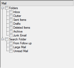
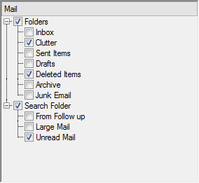
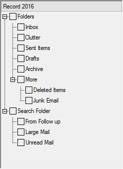
By default, TreeView does not display check boxes beside nodes. In order to display check boxes beside nodes in TreeView, set the CheckBoxes property of the C1TreeView class to True.
The following code snippet sets the CheckBoxes property.
The check box next to a node can be checked by setting the Checked property of C1TreeNode to True. You can also alter the state of the check box of a node by setting the CheckState property of C1TreeNode to any of the following values from the CheckState enumeration of System.Windows.Forms: Checked, Indeterminate, and Unchecked.
In addition, you can change the state of the check box of a node by using the Check or the Uncheck method of C1TreeNode, respectively. These methods accept a parameter allChildrens of the Boolean type. The parameter allChildrens determines whether the check boxes of all child nodes within a node will be checked or unchecked. C1TreeView provides the CheckAll or the UncheckAll method using which you can check or uncheck all the check boxes beside the nodes. Moreover, using these methods, you can check nodes recursively in which if a parent node is checked, all the child nodes under it are recursively checked.
See the following code snippet for reference.
TreeView allows you to easily display custom button images for nodes by using an image list.
Create an instance of the Systems.Windows.Forms.ImageList class and add images to the list by using the Add method with the Images collection of the list. Set this instance as the image list of TreeView by using the ImageList property of the C1TreeView class.
To access the collection of images for a particular node, you need to use the Images property of C1TreeNode. And to add a specific image from the image list to a specific node, add the index of the image by using the Add method of System.Collections.ObjectModel with the Images property of C1TreeNode.
To see the implementation, refer to the following code snippets.
In TreeView, you can customize the way icons appear for expand buttons and check boxes.
To customize the icons for expand buttons, you need to set the ExpandButtonStyle property provided by the TreeViewStyles class. The property accepts values from the ExpandButtonStyle enumeration. By using the values, you can set any of standard System, VS2015, or Windows10 views for the expand buttons. To customize the icons for check boxes, set the CheckBoxStyle property of TreeViewStyles, which accepts values from the CheckBoxStyle enumeration. Using those values, you can set any of the standard System, MS Office, or Windows10 views for the check boxes.
Notice that you can use ExpandButtonStyle and CheckBoxStyle properties only after accessing TreeView styles by using the Styles property of C1TreeView.
The following code snippets demonstrate the implementation.